Sold my late aunt's house, which was build in 1930 and has never changed since.
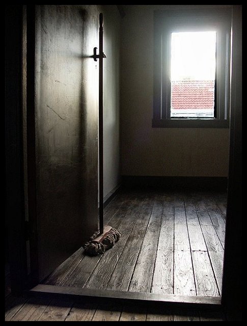
I think the bright afternoon sun shining through the attic window, will get some remarks as being too bright, but I think it displays a nice light on the wall. This photo gives me the feeling of being abandonned, which actually was the case, because the house was sold last week.
Only thing I did was resizing, sharpening and darkening a bit.
Statistics
Place: 18 out of 114 Avg (all users): 6.1897 Avg (commenters): 6.8889 Avg (participants): 6.0143 Avg (non-participants): 6.2568 Views since voting: 1477 Views during voting: 437 Votes: 253 Comments: 24 Favorites: 2 (view)
I know the flair of the window would get me lower points, but as I was DQed just before in another challenge for something I didn't know I wasn't allowed to do, I got scared of doing too much to this one, even if it was advanced editing. I'm not to good yet at post processing and didn't quite know how to get rid of it without making it look worse.
I took this photo, standing on the attic stairs and there wasn't any other position to achieve the same atmosphere and the sun was still shining bright.
Nice image and processing but the blown out top window really distracts me from enjoying the image. I think your item would have been more effective with a different placement. Still a good photo with nice focus and textures.
SDW
This picture happens to also fulfil the current "framing" contest, more or less, coincidence I guess? I like the picture although the light from the window is a bit too bright for me, especially for "advanced editing", but maybe that is on purpose? Otherwise I like the picture
Very nice shot... a little blown out but almost impossible to get the light without a level of it. I have a bit of that in my photo this challenge as well. A 9.
This is my top pick for the challenge I've given it a 9
the only thing stopping a 10 is the color of the roof outside the window... I'm not sure how I would change it but I find it distracting to the overall coloring and it draws my eye out when I'm trying to look at the main interest of the photo, the floor and mop head... maybe a color shift in the tiles to a greenish tone would do it
nice photo, I like the composition, lighting, and framing, the colors are nice and rich too, only thing is I wish you could have gotten the light from window a little less exposed w/o darkening the rest of the pic too much, course I'm not sure how you'd do that, lol, 8





 Add photograph to your favorites
 Add photographer to your favorites


 Photographer found comment helpful.


