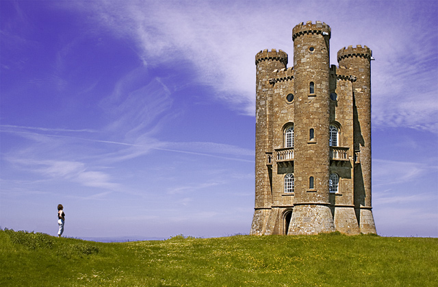
1. I used a Canon 20D rather than the Ixus POS in the original.
2. The elements in the image are much clearer.
3. The grass was cut in the original(and no buttercups)
4. This version shows more of the Tower
5. This was shot at noon in June rather than mid afternoon in March, so creating more shadow. (I was restricted when I could take the shot this time)
6. There are clouds in this version.
7. There is very little editing in this version, so what you see is what I got.
So is Take 2 better?
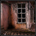
For me it is a much sharper clearer image, but does not have the impact of the original. The original developed the graphical relationship between the three primary areas of its composition; the green area for grass; the purple-blue for sky and the sandy colour of the tower. It was the graphical interplay rather than the photography that made the image appealing.
Take 2 does not have this interplay and is therefore a completely different style of photograph, which whilst being a good photograph, does not have the same appeal of the original. So it's
Ixus = 1
20D = 0
IMG_2665.CR2
Statistics
Place: 38 out of 161 Avg (all users): 6.4444 Avg (commenters): 7.1000 Avg (participants): 6.1846 Avg (non-participants): 6.6186 Views since voting: 1394 Views during voting: 273 Votes: 162 Comments: 18 Favorites: 0
First Impression - the most important one: You can really see a huge difference from the original ... but I agree the first one worked far better than this shot.
Subject: Meets the challenge, and creates an kink in the pattern I have seen so far with the scoring being significantly lower in this image to the original .. but I think you may have anticipated that based on your photog.s comments.
Composition: The composition works ... with the castle and the person both taking in the seperate thirds ... The fact that she is looking up just acknowledges the size and enormity of the castle. What I don't like is the grass really does need mowing in this shot .. it looked so spactactular in the previous shot.
Technical (Colour and light): The castle and person are nice and crisp focus wise ... you have not oversharpened which is good ... you can make out details in the castle ...which creates an interest point for the eye.
To grow its vote?: Go and take it in yet another season .. I think that season wise the other capture worked better (personally)
Summary: Good work keep it up.
If you've got any questions about this critique, please feel free to contact me via the PM system.
So Artan, interesting in that you received such a different score. The bottom line is there may only be small difference between a 6.4 and a 7.1 (but they mean a lot).
In this one I think you have better elements and worse.
The biggest problems with this (compared to the original), IMO, are the grass (you should have brought the mower, eh?), and the time of day. Yes, there are more shadows, but the lighting is much more harsh.
The castle composition is better, I do like the clouds too. So overall, I can see the lowered score. Still, both are excellent shots. a 6.4 is still nothing to sneeze at.
I like your self-analysis of the shot, and the differences with the original Ian. I would quibble with only one thing - you hint at a distinction between 'graphical interplay' and 'photography' where no such difference exists, I think: the point being, that as your camera renders this scene into two dimensions, you are making a graphic of it - two dimensional shapes; it's the interplay of that and the recognisably 'real' world that proides most photographic interest in most photographs.
I think the one huge difference that you didn't put dow is where you were in relation to the castle and model. I think the different horizon really changes the photo as well. Not having two of the pillars facing the viewer on the hill liek the original changes a critical element in the shot. Still a great shot and improving on a 7.1 shot is nearly impossible and this newer version is great also.
Wow, I'm surprised that you like your original better. To me, this one is much better. I like the clouds, the lack of noise, and I like how the image is just brighter in general - which creates a completely different mood. In fact, I even like this view of the tower better. Anyway, both are good, but I feel that this one was severely underrated.
Hmm... Well - I liked the composition of the orginal better - though I'm sure it's nice not to have any visible noise. You caught a pretty cool sky though.
Go figure - I do like this one much better - score doesn't reflect that this was not greatly improved, IMO - just a tougher crowd of voters in a tougher competition I think. Well done.
This is definitely another toss up. On one hand, you did very well using your P&S. Now armed with a dSLR, it seems that part of the edge is gone. It's still is a great image but improving on a really high scoring image would be a tall task I believe with this rendition. (7)
The sky really improves the photo. Great image contrast(I.E. the huge tower versus the little woman) I like teh comp although the tower seems to be leaning to the right a bit.
OMGoodness! What an improvement over the original! Fantastic color, clouds, everything but the horizon and tower straightness. It still seems a tad off, leaning to the right, just a touch. I would have given the original a 4 or 5 if I had voted in that challenge, this one gets an 8 for color and clarity improvement! :)
There's a lot to like in the original and this one. I like the light and color of the grass a bit more in the original. However, the clouds and color of the sky are much improved. There's also more detail in the tower.
Wow, looking at the image this is based off of, this one is about ten times better. What a beautiful image and a successful reshoot. I love the composition, the color (especially the purple/blue sky), and the sense of scale with the person standing near the soaring tower, looking up in awe. You chose the right time to shoot this, with the light and clouds absolutely beautiful. Going straight to my faves.






 Add photograph to your favorites
 Add photographer to your favorites

 Photographer found comment helpful.


