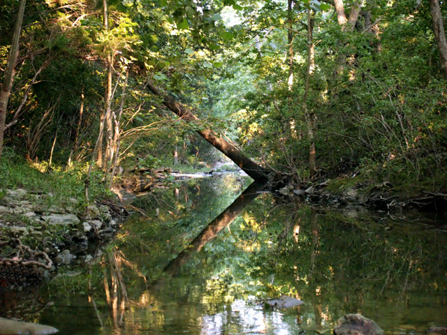
I love this spot.In the city, can hear the traffic, but try to meditate it out. Neat Image, hue & saturation adjustments, levels,Curves, slight blur to soften image, resize for web.
Statistics
Place: 132 out of 161 Avg (all users): 5.3631 Avg (commenters): 6.1818 Avg (participants): 5.2500 Avg (non-participants): 5.4330 Views since voting: 1526 Views during voting: 202 Votes: 157 Comments: 13 Favorites: 0
First Impression - the most important one: Fantasic improvement .. not only in the scoring but in the shot itself.
Subject: Meets the challenge very well.
Composition: I think that the change from portrait to horizontal has worked incredibly well ... the reflections are clearer .. and the colours are brighter. The fallen branch also adds to bringing interest to the shot and giving the eye a really neat focus point.
Technical (Colour and light): Less grain (tick) better lighting (tick) .. I think this was achieved through a different time of day or season ... and capturing it this well second time around is great. But it is still an extremely busy shot . .and there is little you can do about that.
To grow its vote?: Minor cropping changes ... I think you hvae done well and maximised this shot ...
Summary: Great work .... and a fantastic improvement.
If you've got any questions about this critique, please feel free to contact me via the PM system.
This is obviously a beautifull place. I find that my eye is drawn directly to tree trunk and its reflection, and it is difficult to move off this powerfull anchor. Perhaps cropping a little off the left may help with this.
This version looks a lot better. It's sharper, has better color and the original's signal to noise ratio can't even compare to this one. So great job improving the technicals overall.
The composition is ok but doesn't really add anything to the viewing experience, IMO. I actually like the original's composition better and I did something similar with a photo of mine: //www.dpchallenge.com/image.php?IMAGE_ID=294261. If you notice I cut off the top part of the trees so that I could move the edge where the land and water meet off-center. I thought it came out much better that way so if you reshoot this in the future consider every possible shot even ones that may cut off part of what you are trying to capture.
I remember your original image, though I can't find it now. It was really small and I remember downloading it to try to see what it was about. This one is much better. Love the color play in the water. Good choice to redo.





 Add photograph to your favorites
 Add photographer to your favorites

 Photographer found comment helpful.


