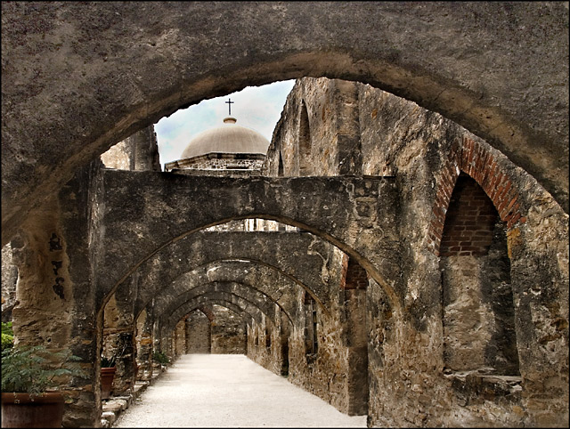
This is Mission San Jose in San Antonio, Texas. It was built in 1720!! It's on beautiful grounds, and they still have church services here every Sunday!
When I did my original in the Leading Lines challenge, I got several comments that I needed more contrast. I decided this time to do a slightly different angle, and do it in color just to add more contrast.
Statistics
Place: 16 out of 161 Avg (all users): 6.7730 Avg (commenters): 8.8333 Avg (participants): 6.3788 Avg (non-participants): 7.0412 Views since voting: 2208 Views during voting: 242 Votes: 163 Comments: 35 Favorites: 6 (view)
You certainly got more contrast here and I feel the colour version adds to the feel of the shot.
Just one thought, to take it up another gear again, is to include an object /person in the small arch/doorway at the very end to give the eye more of a journey.
Excellent, dear friend..... You so deserved this score, as it is an amazing image..... You have amazing talent, and you are now constantly in the top "twenty"..... Way to go girl, you "ROCK".....
Congrats Sandy on another Top 20, and kudos for taking a risk in trying to improve on something that did so well the first time, You tied the finishing place and upped the score by more than 3/10ths, WTG.
Well unless there are a couple of people walking down this path and taking pics I may guess who I am commenting on. This is very nice and I will probably bump it up come end of week. Great detail, great colors, great lines. This has the feel that I was wishing the first one had. And the peek up into the sky outside the corridor is a nice little treat to top the whole shot off. This should easily do better than the original. Beautiful shot Deb.
Edit: So there are two of you in the same place. So now I edit my critique for you Sandy. Everything stands the same including the feel you have on this one compared to your original. The detail and postprocessing stand out way better in this one. A great feel, presentation and fantsastic detail to this shot and I would expect it to do better in score over your original - even though you had a pretty good score to start with. I will still most likely come back later on and give this a bump - so expect another edit.
Edit - Bet this is the longest comment post you have ever gotten during a challenge before huh? Bumping up (but dont tell Melethia)
I LOVE the leading lines and the perspective, re the arches..... A stunning image, full of history, as it tells a story.....The textures are excellent, and the earthy colors really help to make this image stand out..... It is like there are two pitcures in one re the old arches, and the small section at the back, with the sky and dome. I give this a "10" as I love it.....
Excellent composition capturing the lines and curves along with the depth as you are taken down the path to the vanishing point. The colors in the walls just makes this picture pop. Bravo! 10
Not sure who's shot this is but I'm thinking it's SandyP's. Whoever you are this is fantastic! I like this angle better than some others I've seen of this church and the editing just makes it all come to life.







 Add photograph to your favorites
 Add photographer to your favorites

 Photographer found comment helpful.


