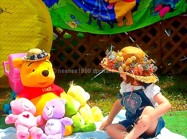
I think there is too much stuff going on in the background. if you had cropped out the banner and maybe shown a bit more of the blanket and her leg, think you would have put more emphasis on your young model. maybe a bit more color saturation on the care bears would have helped too.just a thought you had some really nice stuff going on
did you use smart blur on this? the image is endearing (you could probably crop just above her head), but would have liked to see this without the effect used.
Cute shot. Softer lighting (at sunset for example) would have been more "dreamy", but may not have conveyed "summer" as well. Tough choice, but the bright highlights on the rightmost toys are distracting. A lot of lines in the picture (including the direction of the girl's face and the angle of the smaller toys) lead the viewer's eye to Pooh, making him the center of interest, and he is looking out of the photo, emphasizing this. I'm not sure this is what was intended.
What a wonderful interpretation of the theme. The colors bounce out at you. The sharpness is a bit strong around the little girl's hat which takes away just a small bit from an almost perfect picture.
quite a colorful shot but what was done to the hat and emblem on the girl's jeans? looks like a watercolor effect was placed on it or something?? just wondering
A bit overexposed, espcially the yellow (far right) bear. The lighting and focus on the girl are quite good. If you cropped it so she was all you saw (might have had to reshoot without the yellow bear) it would have been a really nice shot. This is definitely a case where closing in on the subject would have improved the shot tremendously.





 Add photograph to your favorites
 Add photographer to your favorites


 Photographer found comment helpful.


