Camera Work/Technical: Everything looks nicely focused, and your coloring works well for this image.
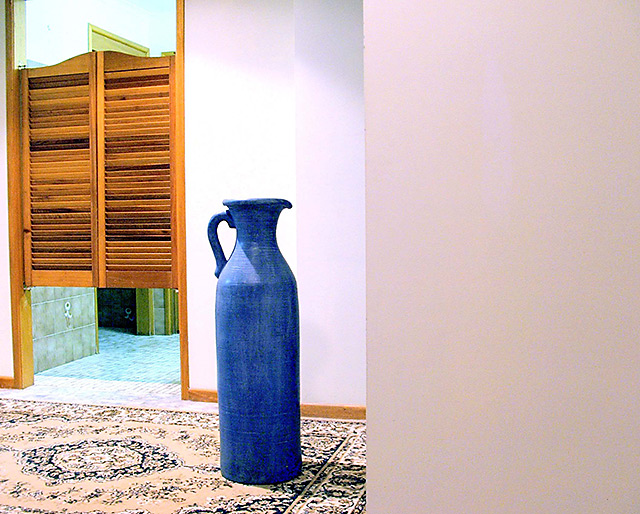
Lighting: I think that this one is a bit overexposed. The bright wall behind the jug seems blown out, as does the detail in the rug underneath.
Composition/Content: I think that the wall taking up over 1/3 of frame hurt the scoring. It adds a very crowded feeling to the image and adds a great distraction to the eye.
My Opinion: I don't get an empty room feeling from this particular image. I think it scored pretty close to its potential as it is, but with some small adjustments in several areas, it could have done much better.
I find this picture strange. I think the plain wall on the right is pretty uninteresting, and yet takes up 40% of the picture - it could have been cropped. The rug is quite busy. The blue pot is unusual, but hasn't been placed in a position that makes me interested in it.





 Add photograph to your favorites
 Add photographer to your favorites


 Photographer found comment helpful.


