Hey there from the Critique Club
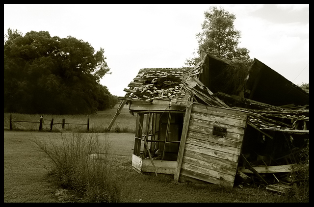
Camera Work/Technical: I like the strong, crisp focus, as well as the deep depth of field that keeps each part of the image in focus. I do prefer the duotone conversion, but you lost some of the shy detail.
Lighting: The sky is pretty harsh and overpowering in this version. I believe that a graduated natural density filter or a soft light gradient layer in post processing would have helped this one out a great deal. You lost some of the valuable detail in your highlights and your shadows. Your first one was lit better.
Composition/Content: I prefer this landscape orientation and composition as opposed to the square crop of the original. The fence you included on the left of this image helps pull the eye around the frame and the openness gives more of a sense of freedom in the outdoors.
My Opinion: As is, the original submission is better. With slight lighting adjustments, I think this one would have easily pressed in to the 6 range of scoring.
Eric
|






 Add photograph to your favorites
 Add photographer to your favorites


 Photographer found comment helpful.


