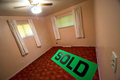
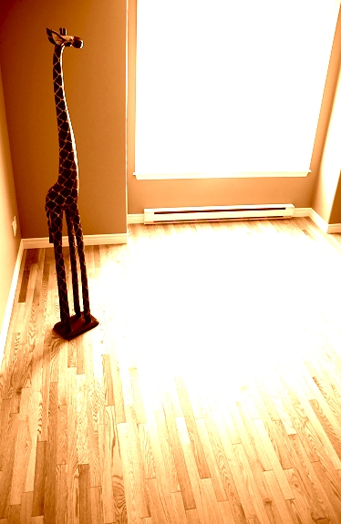
I disagree with most of the comments--the blown out doesn't bother me at all--I love the shot. However, I think it would have been even better if you shot it from down low--more of the giraffe's point of view.
I really like this image, nicely composed and choice of tone. Do find the big bright spot on the floor somewhat distracting, but it does give off the hot sun feel you where I guess trying to portray.
Not a bad idea. Brown tones and natural light selection is good. The huge overexposed reflection on that beautiful wood floor hurts this composition. Avoid overexposed ares in images unless it directly contributes to the theme of the image.
Nice picture but too much light for me, although i know it is meant that way. It does fit the title of the picture, though, and challenge is met, so an eight from here ...
The blow out in the middle can't be good; I know its symbolic of a bright sun, but its not fun to look at. THe composition and the girraffe placement are an A- or even better though.
nice clean composition. Though the right edge of the photo could have been cropped tighter. The wall to the right of the window is distracting. However, the tall giraffe filling the left third of the photo is dynamic. Many photographers would freak out by the sunlight getting burned out on the floor, but i think it's ver effective. There is detail established elsewhere on the floor. The bright spot adds some drama to the composition.
I think this image is a good one. I'm not a big fan of the sun through the window though. I Like the idea...I think it may have been more effective with a less blown out window. Nice composition and idea though.
good idea but the blown out highlight on the floor and window is a big distraction. Almost hurts my eyes to look at it cause of the brightness. Maybe a different angle would've been better where the light isn't so strong.





 Add photograph to your favorites
 Add photographer to your favorites

 Photographer found comment helpful.


