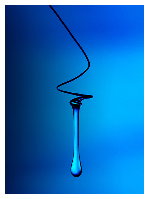
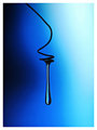
Most people liked the original image being blue and a single droplet so here's my interpretation of it. I'm not sure if this will meet the challenge or not.
We'll see.
Shot in RAW and converted with RSE. Created an adjustment layer (Levels) to pump up the colors. Selected the blue background and duplicated the selection as a layer. Adjusted levels to create dark areas on left and used erase to history at 20% opacity. Cropped and added 15 pixel border. Saved for web.
IMG_5924.CR2
Post Challenge Yikes! Tough competition! 7.37 and 4th! DPC is getting tougher by the minute ;)
Margin of Improvement A whopping 1.251! This just proves that comments and outtakes work wonders ;) Thanks everyone!
Anyway, I posted these in the thread but here it is as well.
Original
How did I end up with the blue background? Because of this outtake ;)
Statistics
Place: 4 out of 161 Avg (all users): 7.3765 Avg (commenters): 8.1500 Avg (participants): 7.2188 Avg (non-participants): 7.4796 Views since voting: 7648 Views during voting: 377 Votes: 162 Comments: 46 Favorites: 25 (view)
Congrats Rikki. A very fine shot indeed. It kills your first attempt. That's a very high score for no ribbon. Never mind at least you get closer to your 6 average.
Sorry to see you only in the 4th place with this beautiful photo, very well done on all techicals and it´s simply awesome in it´s simplicity. Nice work my friend!
ok so I counted 27 of your challenge entries and did not find a water drop. would it be so hard to put a thumbnail in your challenge description? none of the ribbon winners bothered to do it, either.
I would swear that this was Rikki's. I know that he did a shot almost identical to this, just not for a challenge. Which kinda goes against the "letter" of the challenge description - but in my opinion, it doesn't go against the "intent" of it. So, long story short... This is an outstanding shot. Big improvement over the one I think it's a reshoot of. Great work. 9
Water, even to someone not familiar with chemistry, is not that viscous. As an image alone, it is interesting and the colour blue pleasing. The simplicity is appealing. Perhaps the title should be something like: "Viscosity."
Yes, that's an improvement Rikki.
Smoother gradiations. No halo around the water. Looks like you used some black cards this time to get the water to outline better.
Great reshot, Rikki. Looks very close to your original. I would, however, like to see a bit more contrast in this version. Otherwise an excellent study in viscosity and macro photography. Nice job.





 Add photograph to your favorites
 Add photographer to your favorites


 Photographer found comment helpful.


