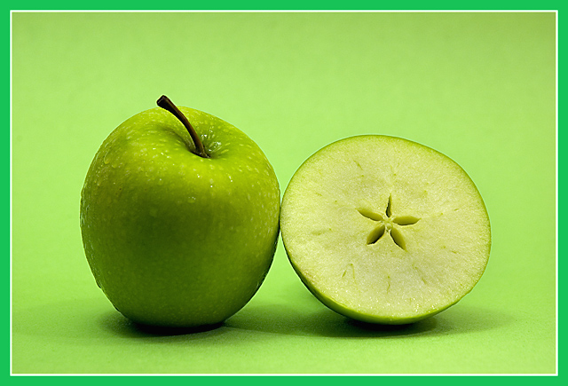
Solid black border may have been a better choice, this color of green fights against the natural yellow/green of the fruit. I really like the design in the half and the background color works well.
I like the idea of this image. It's clear and concise but I think the minty green of the border doesn't add to the overall quality of it. To me, I find it distracting and in a different color value than the more lime/yellow green of the granny smith apple and background. I would like to have it less centered with some more negative space. I prefer that the subject not be in the middle like a target's bullseye. It works sometimes, and it isn't the worst thing in the world, but I think it would be more artful if the apple and half were to the left with more area to the right and in the foreground.
This is such a nice shot - and that border is just awful. Normally a small border doesn't bother me, but the color of this one completely clashes with the rest of the composition IMHO. I'm sorry, but without it I would score this a solid 7 - it's a technically strong and appealing image. With it, I'm struggling to give it a 5.






 Add photograph to your favorites
 Add photographer to your favorites


