Critique Club
Composition
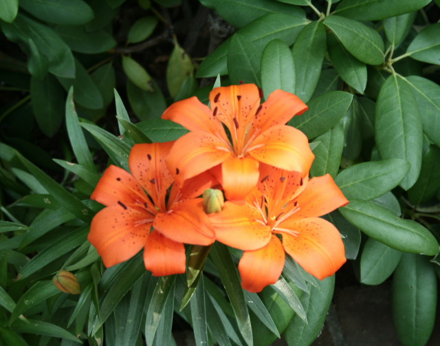
Shot is very center oriented, which is a bit common, try to see if there's a different angle or composition which might make things a little bit more interesting. Also, the first thing that grabs my attention is the orange flowers. whilst the flowers are nice, the challenge is green, and so this makes the shot score much lower. It's also a bit flat, and i would have liked to seen a bit more contrast.
Technical
Image is very soft, and it seems you've focussed behind the flowers, and as such it makes the image very drab, as though the flowers grab your attention, theres no detail to hold the attention their. maybe a bit more dof to get the flowers into focus too
Post processing
No comments makes it hard to give feedback, so try to leave details of what you did next time. But basically it needs a lot more contrast. Some playing with selective colours would also be beneficial to bring out the colours you want.
Overall it's a great first submission, and i hope to see more :). I've been very direct and to the point in this critique, but don't take it as an insult, i just want to offer you more ways of improving.
Critique Club Composition
Shot is very center oriented, which is a bit common, try to see if there's a different angle or composition which might make things a little bit more interesting. Also, the first thing that grabs my attention is the orange flowers. whilst the flowers are nice, the challenge is green, and so this makes the shot score much lower. It's also a bit flat, and i would have liked to seen a bit more contrast.
Technical
Image is very soft, and it seems you've focussed behind the flowers, and as such it makes the image very drab, as though the flowers grab your attention, theres no detail to hold the attention their. maybe a bit more dof to get the flowers into focus too
Post processing
No comments makes it hard to give feedback, so try to leave details of what you did next time. But basically it needs a lot more contrast. Some playing with selective colours would also be beneficial to bring out the colours you want.
Overall it's a great first submission, and i hope to see more :). I've been very direct and to the point in this critique, but don't take it as an insult, i just want to offer you more ways of improving.






 Add photograph to your favorites
 Add photographer to your favorites

 Photographer found comment helpful.


