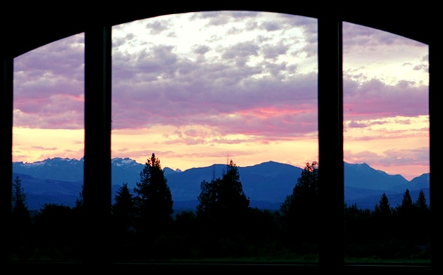
This was a hard challenge to shoot for, since a lot of my entires were either really boring subject wise, or else imposssible to reproduce. This one I at least could do again, since my window hasn't shifted in the last month. The most notable comment I got was that the view out my window was too 'generic', so I re-shot at a more dramatic time of day (which is actually what I wanted to do for the initial challenge, but we had really lame sunrises all that week). The one thing I couldn't fix is the uneven sides, because I angled out the window to avoid the house that is to the right.
Statistics
Place: 123 out of 161 Avg (all users): 5.4395 Avg (commenters): 5.8000 Avg (participants): 5.3088 Avg (non-participants): 5.5393 Views since voting: 914 Views during voting: 216 Votes: 157 Comments: 7 Favorites: 0
First Impression Colors add little more to this comapre to the original.
Composition: Height is just 393 pixels. I would like to see more height.
Subject: Improvement over the origianl in terms of colors and interesting coulds. But the composition is almost smae. I don't know if there were any comments on the original about the height.
Technical (Colour and light): The color and lighting okay.
Improvement: Different composition which allows more height.
Summary: Just notices the take two is almost same score as the original.
CTCP2 Gunnsi
First impression: It is dark and overblown. Beautiful colours there in between.
I like the other one more than I do this one.
What can you do better? It is better to take a dark photograph of clouds and use post processing to lighten it up with levels. It is impossible to fix blown clouds. I am no expert but my "Fool on the Hill" photo is a good example on clouds before and after.
Nice sunset, but the original image seems to be better overall. I can't figure out why. Maybe it seems to have better clarity. Anyway, it is nice to see the various moods one window can give you. Quite a view if that is what you get to look at every day.
Not sure if you were taking the frame out of the equation, but maybe a fill flash to put some light on the frame, this type of shot is very hard to be able to balance the light on both subjects....5





 Add photograph to your favorites
 Add photographer to your favorites

 Photographer found comment helpful.


