Original shot taken for the Your Corner of the World challenge. It was my 12th challenge and I believe it would have won a 3rd if not for the infernal border I chose. Fully 24 commenters remarked that the border was distracting. I learned my lesson.
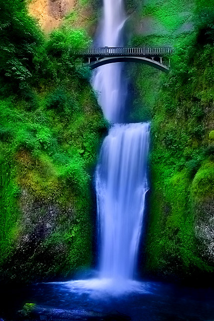
It's interesting to see the difference the season makes on the water. The original was taken in Sept and less water makes for an easier time with blowouts. This was taken at dusk. The cropping difference is the difference between the 17-40 and the 24-105. The bridge appears more level in this shot, but it's actually a matter of perspective rather than the original being out of level. The left side of the bridge is closer to the viewer than the right and that leads to the tilted appearance. This shot is taken slightly to the right of the original (hiding less of the upper fall) which level the bridge out.
I tried to stay true to the "dreamy" look of the original. I had just found Neat Image back then and really went crazy with it on purpose. This shot used NI as well, but I lowered the opacity of that layer to about 30%. The deep colors are a result of saving the file as a JPEG, then reloading it as a layer UNDER the already present adjustment layers (thus doubling the effect of every layer). Sometimes you get lucky and get some good results.
PP layers:
Converted in RAW twice (one for the water) and blended
Cloning (leaf in foreground, debris in water)
USM after resize
Saved JPEG of above layers with adjustment layers
Hue/Sat (boost, shift +10)
Selective Color on water (cyan +10ish)
Brightness/Contrast slightly masked off water.
Statistics
Place: 19 out of 161 Avg (all users): 6.7580 Avg (commenters): 7.5238 Avg (participants): 6.4839 Avg (non-participants): 6.9368 Views since voting: 13681 Views during voting: 328 Votes: 157 Comments: 36 Favorites: 20 (view)
This is absolutely stunning! I was looking at your tutorial on how to photograph waterfalls, wish you'd posted more on the post processing, but only cause I'm a dummy at photoshop.
This one is a good shot, but apart from the border, i like the original way better than this. The understated looks of the original works for me. Compared to that one, this seems to be shouting out loudly!
Wow! well done, I have to agree the border is distracting but the post processing really works. Looks like you did the orton effect. I have just recently learned how to do it and I think it will work great on my falls shots. I can't wait for spring.
Do you use any other filters other than nd filter? or do you do most in post processing.
Sam
The Waterfall Hunter
Nice color for the most part, especially the greens, but I feel that the water is a bit TOO blue. Compositionally, however, this is superb. Compared to the original shot, I like this more isolated composition without the foreground log.
DNMC :P This is waaay better with no fancyu schmancy border Achoo! I think you're trying to compete with me via the patented Hyper-Processing™ editing techniques eh? Sweet shot dude!
Holy saturation Batman.
Split the difference on the shutter speed and saturation boost between this and the last one, and I'll give you a 10.
As it is, 8
I'm going to assume this is Jason's. Improvements over the original - straightened the bridge, lost the border. :-) Do I like this one better? I'm not sure. The first one was processed well but I'm sure there was some room for improvement. This one seems a bit over the top to me, though. I've no doubt the foliage is a wonderful green this time of year there, but is it really that green, and the water that blue? It's still a damn fine shot, but in my completely unprofessional opinion, I think I'd like something between the two.
surreal for sure. Great color contrast between the blues and greens. I would prefer the greens be somewhere between your original and the hyper-sat greens of this one. Like your tighter cropping choice and the lack of a border on this entry.
This looks like a lovely fantasy world, maybe something out of Lord of the Rings, or Narnia, or Perelandra. The detail of the hillside gives it a lovely texture. The placement of the bridge is other worldly. The soft flow of the water belies its power. In short a stunning photo which I like very much. That being said, the water is very blue and I can't help thinking I'd like it better if it weren't quite so blue.
Multnomah Falls is such a beautiful place to photograph. You did a great job of catching it's beauty. Did you read the legend of the Indian maiden while you were there?
Damn, you went for the full Rikki here didn't ya? If it were me I'd have toned down the warm rocks upper left, made 'em cooler; they really stand out among these surreal blues and greens, to no good advantage.






 Add photograph to your favorites
 Add photographer to your favorites


 Photographer found comment helpful.


