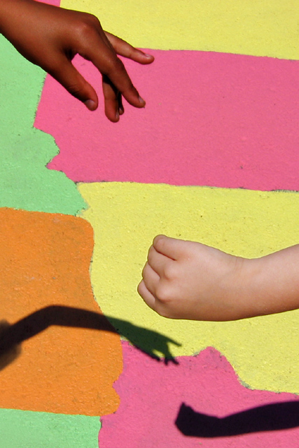
A remake of my 10th submission, almost 4 years ago. I once again was rushed (by my models) and didn't frame it quite as well as I'd have liked, but I did get the hands closer together, which was the major complaint for the original, along with the busy background.
In this case, I thought the colorful map of the USA painted on the playground would make an appropriate BG without being TOO busy.
-Handheld, auto mode, bright midday sunlight.
-Cropped
-Cloned out part of the shadow of the model's head on the left
-Created separate masks for each kid's hand
-Applied one RGB Curve each separately to each kid's hand
-Resized for DPC
-USM at 16%/64 dia/TH=0
-SaveAs JPEG at quality 9/10 = 150kb
Statistics
Place: 118 out of 161 Avg (all users): 5.4679 Avg (commenters): 6.0000 Avg (participants): 5.1719 Avg (non-participants): 5.6739 Views since voting: 1221 Views during voting: 215 Votes: 156 Comments: 7 Favorites: 1 (view)
Camera Work/Technical: Excellent colors that help project the strong message behind the capture. I also like the the vivid background and the fact that it really sets the hands off, giving them nice pop. I also feel that the hand at the upper left corner is just a hair out of focus.
Lighting: Very nice. You did a very nice job with harsh lighting. You kept all the detail in both hands without blowing the bright background. I can even see the veins in the had coming in from the right.
Composition/Content: Nice content, but I think your composition suffered a bit this time. I think that the background is a vast improvement, as is the overall contrast of the image, but the hand positions seem a bit awkward. I know full well how difficult it is to work with the youngsters, so getting in perfect would be near impossible.
My Opinion: I agree with the voters that this is an improvement over the original entry. Nice work taking a really neat idea and improving on the overall execution.
Thanks all -- I wasn't overwhelmed with cooperation from the kids -- I think the whole set-up and shoot took less than four minutes out of their recess period! I was aided in getting this shot by being able to use the tilt/swivel LCD on the Canon to hold the camera high overhead and shoot almost straight down, and get the hands closer to the shadows -- probably the number one comment on the original, along with the flowerpot.
Hey paul ;) I hope this is yours. The focus on the upper hand seems a bit off. However, I think this is still a good improvment over your original entry ;)
I like the message here ... I'm sure most people do. The composition is different and the eye bounces all over the place. I think this works. The bottom hand might be better open or more similar to the top hand to allow for a historical reference and to be more visible ... but overall very nice.






 Add photograph to your favorites
 Add photographer to your favorites

 Photographer found comment helpful.


