Hi, as requested, here is an indepth critique of your submission.
First Impression - the most important one: Nice shot, but I'm seeing a few imperfections that could have easily been fixed.
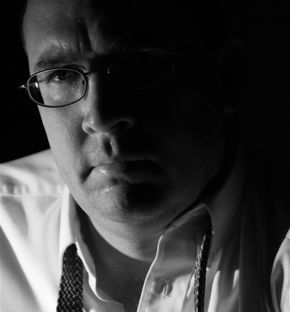
Composition: I like the composition for a portrait. It may be a little tight, but not by much.
Subject: Can't really miss him and there isn't any distracting background ,so all is good on that front. Also, looks like you met the challenge well.
Technical (Color, focus, and light): Color: I like the black and white treatment, very natural feeling. I think I'd like to see a bit more midtone contrast, but overall the treatment is good.
Focus: Sharp and nice detail. Losing a bit of sharpness on the end of the nose, so perhaps a bit deeper DoF is needed.
Light: I like the lighting. I wish the light fall off on the face would have followed down the neck though.
Other: There is a big distracting white spot over the glasses in the dark part of the face. Since this was an advance editting challenge, I think you should have cloned that out. I think it would make a big difference in the shot.
To grow its vote?: Well, the overall quality of photos in this challenge was very good, so I'd guess that you just got beat by other more interesting subject matter, rather than by your technique. A few technical flaws fixed would have helped a bit.
Summary: A rather nice portrait with nice lighting. Good work.
Nice job with the lighting - having half the face in shadows sets a mood here. The expreswsion fits well with the story you are trying to tell - he looks like it's been a long day/night and he'd love to just go home.
the way the glasses on the left side of the photo make it look like his face is squished in is really distracting. otherwise nice photo, lighting, and mood.





 Add photograph to your favorites
 Add photographer to your favorites

 Photographer found comment helpful.


