Hi, as requested, here is an indepth critique of your submission.
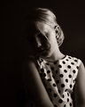
First Impression - the most important one: Nice hi-key shot. I like it.
Composition: I'd like to see a bit more negative space in this image. Loosen the crop some and move the eye to a stronger part of the composition.
Subject: It's an eye. It's right there. Can't miss it :-)
Technical (Color, focus, and light): Color and focus look good.
Light is nice. I'd like to see it about a half a stop more to completely blow the highlights on the forehead.
To grow its vote?: Clumps in the eyelashes stand out to me. I'm no makeup artist, so I don't know how to fix that. Also, I think the eye-liner could be darker.






 Add photograph to your favorites
 Add photographer to your favorites

 Photographer found comment helpful.


