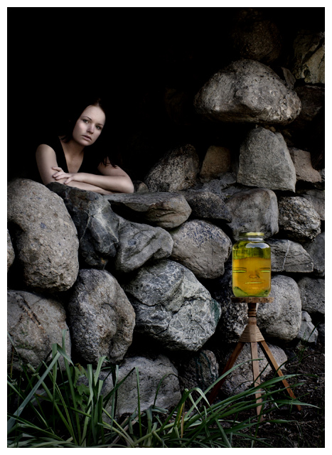
This photo is very dark so it might be hard to see if your monitor isn't calibrated correctly, but I felt it had to be that way to portray the mood of the song.
Converted from RAW
Crop
Draganizer
Dodge
Burn
Clone (Reflexions on Jar)
Brightness/Contrast
Hue/Saturation (Yellows)
Border
Save for web
Statistics
Place: 41 out of 273 Avg (all users): 6.1895 Avg (commenters): 7.8000 Avg (participants): 5.8265 Avg (non-participants): 6.3797 Views since voting: 5503 Views during voting: 519 Votes: 285 Comments: 19 Favorites: 3 (view)
Great shot, not keen on the face in the jar but i like the rest.
Seems to have the 'dragoniser' effect, which works well but you could have just overdone it. That could however have just been her being abit dark.
Really good shot though, well done.
First impression: I love this, although it also looks a bit "dissonant" or disconnected because of the jar/face.
About the image:
Focus is excellent. Absolutely no problem there.
Exposure is good for the rocks, foreground, jar, and girl. As you mention in your comments, the image is dark (at the top left). I looked at this on two monitors, and even though the image looks lighter overall on my laptop, the area behind the girl looks black on both. As one of your commenters mentioned below, I wonder if keeping a touch of detail from within the hut would have been preferable, just a big, like a hint of what's behind the girl. But the exposure for the rest is perfect IMO.
Composition: Very well done IMO, excellent use of the rule of thirds. The white border goes well with the image. The jar/stand is the one discordant element - the placement is fine, but it being there is sort of strange, and counters the dark mood of the picture otherwise. The jar/mask look almost comic, like a little cartoon thrown into an otherwise very moody image. I am not sure how well that works. In a way, it makes a beautiful image into something you're trying to fit to the song. I love the sweep of the rocks, and the girl's expression is just right.
Post processing: Looks to me like you did an excellent job. I like it that even though you applied draganizer, it is not so heavy as to make it look like a "draganized" image. The colours are beautifully muted.
Overall: A good entry for a hard challenge. You got a good score. Your score probably suffered because the image somehow didn't "connect" with a lot of viewers.
I hope this helps.
Take care,
~Ursula
-----------------------------------
Comments/questions/complaints - feel free to email me.
Nice shot and congrats on your new top score, won´t be long till you improve it though if I am not mistaken, you seem to be on the way to getting the hang on what scores well here and I wouldn´t be surprised to see good stuff rom you in the future.
I like the shot, well lit and technically well done, only thing I really dislike is the BLACK backround around the girl, think I would have preferred it if there was something visible there but still dark, like the innards of the hut (or whatever is behind her). Nice work, would probably have given it a 7 in the challenge.
Ok, so I am going to comment this picture OUTSIDE of the challenge. Which means, I will not even take the lyrics into consideration. The reason for this is that I really think you have a powerful picture, but that by trying to stay "on-topic" ruined it a little. I think the mood in the picture is great, the composition is very nice (true, it's a little dark, but again it adds to the mood). What I don't like is the jar. It totally takes out everything you achieved in terms of "mood", expression, etc.
But, congratulations on a very good picture, jar aside ;)
I think this was one of the most popular lyrics done. I KNOW yours is the best. One of two images I gave a 10 to.
I like that window, door, and even the house are all implied, not literal. The comp is excellent, and the face isn't a creepy dolls head stuffed in a jam jar!
I'm impressed that you were able to portray such specific / abstract lyrics in a literal manner! I enjoy the use of negative space in the top left corner, and the subdued colors.
I know you're going for that particular Beatles lyric, but this would be a far better photo without the jar & stand. Or at least something more interesting than that jar. All the contrasts of grass, rocks, and person are great; and she looks lovely against that black background. Her expression is interesing, too.
Eleanor Rigby, picks up the rice
in the church where a wedding has been
Lives in a dream
Waits at the window, wearing the face
that she keeps in a jar by the door
Who is it for





 Add photograph to your favorites
 Add photographer to your favorites

 Photographer found comment helpful.


