Critique Club Composition
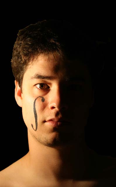
I like the idea, and I like the way you set it up so that you only see one side of the face. Cropping could have been a little tighter, and perhaps more even (looks a bit uneven to me). Also, i think one of his shoulders is higher htan the others... get your bf to stand straight :P. Also, the violin insignia is nice, but could have been slightly sharper. Finally, maybe some sort of an expression wouldn't have hurt.
Technical
image isn't very well in focus. Its a bit blurred. Maybe thats from using the dodgy tripod setup... might be worth investing in at least a cheap one.
Processing
Not a fan of the digital haircut... Contrast is too sharp between background and hair, and so it looks artificial. Also, you could try lightening the eyes a bit to bring them out.
Overall
Nice concept, but the sharpness just isn't there, and the processed looking hair detracts. I see this is your first entry, which is pretty good. Hope the comments are helpful, and hope to see increasing scores :)
There is a little too much contrast between the hairline and the background. You probably could have used the blur tool to make the hair blend in better with the back ground.
I like the half-light approach. It is simple and elegant. However, the edges around the hair lend an inorganic feel to the shot, and makes me think the shot was cut out of a larger composition.





 Add photograph to your favorites
 Add photographer to your favorites

 Photographer found comment helpful.


