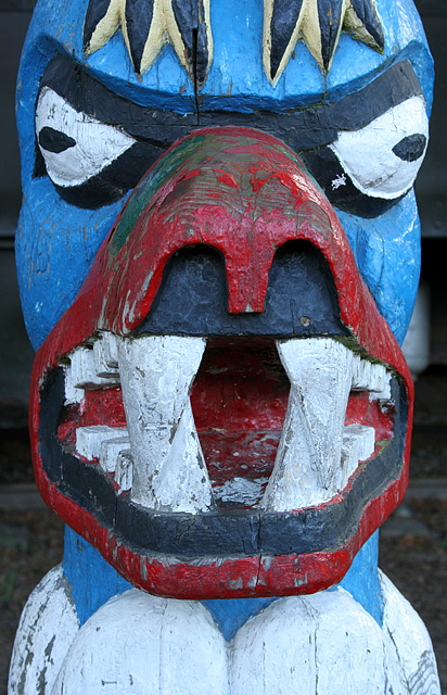
First Impression - the most important one: What an ugly so and so! ...
Composition: it was an interesting choice to fill the frame wit the statue. In doing so the photo no longer meets the rules of thirds ... or the golden triangle .. both of which may have helpedthe image by dragging the eye further in.
Subject: It does meet the challenge, but I think the issue is more about how interesting the image itself is .. and how it is created.
Technical (Colour and light): The statue itself is very well in focus and nice and sharp. but the lighting of this shot has not helped. I think that it is naturally lit, and in this it is quite flat. If you had been able to use lights to help and shape the statue this may have stopped the image itself being flat. I think that the DOF here is great ... and well done.
To grow its vote?: Really think about where the light is coming from for a shot ... if it is natural light .. think about where the sun is hitting the image, and maybe take shots at different times of the day to see how the light changes the image. I think that this may have helped.
Summary: Looking at your portfolio, you seem to have gone right outside your comfort zone with this picture, and I think that is great. It is an impressive try with a new style. Good work.
If you've got any questions about this critique, please feel free to contact me via the PM system.
Interesting object - I'm afraid not terribly interestingly shot. Filling the frmae certainly adds a little impact, but the light on the object is very flat indeed - distinguishing the teeth is nearly impossible - and perhaps some sense of environment would help - something for it actually to be protecting? Technical stuff is fine, but not enough alone.
I'm not sure that's what they meant, but that's very funny. Especially when you're scrolling down from the top trying to figure it out. I almost jumped a little bit.






 Add photograph to your favorites
 Add photographer to your favorites

 Photographer found comment helpful.


