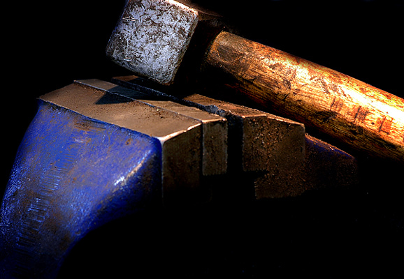
Taken at a mechanic's garage near me. The hammer was lit using a single bulb, from the top. The camera was set on a tripod and a self-timer was used to recude shake (exposure time = 1.6 seconds).
Statistics
Place: 68 out of 238 Avg (all users): 5.9102 Avg (commenters): 6.6364 Avg (participants): 5.8108 Avg (non-participants): 5.9532 Views since voting: 1207 Views during voting: 318 Votes: 245 Comments: 14 Favorites: 0
The lighting in the photo created a good 3D-ness to the whole photo, so I think the angle you chose to light from was effective. I think that the over-exposed area on the wooden part of the hammer is distracting though, and being an Advanced Editing challenge, it would have been worthwhile cloning it out in my opinion, or not lighting it so harshly in the first place. The lighting on the rest of the imager however is spot on. The way the background is blacked out and the bottom fades to black both look very effective, especially with the vibrant colours you've captures.
Compositionally, I feel I have to agree with your comment from e301. The fact that the top of the hammer is cut off seems very awkward, however I do think that the rest of the composition is good. It just needs that little bit extra at the top. The negative space in the bottom created a nice shape and flow to the photo that I think would be lost of you cropped that space out.
The post-processing is well done, with the sharpness being suitably subtle in application, without any tell-tale halos. The colours have been brought out perfectly, and the contrast, although a little high on the handle of the hammer, seems good throughout the rest of the photo. I don't see any noise, but I'm curious as to why you used ISO 400 when you had everything set up on a tripod for a long shutter speed anyway. Using a lower ISO could have helped in reducing the bright area on the handle.
Overall, a well done photo with just a couple of small technical flaws. I hope you find this critique helpful :)
There's some stuff that is nocely done here, although your framing/cropping, I'm afraid, really isn't part of that. Why on earth cut off the top part of that hammer? Especialloy when all you have in the lower part of frame is the very extremitiy of that vice? The tonality and light are generally good, although the highlights on the hammer's handle have got out of your control slightly. The feeling that a slightly higher view-point would have solved almost all of those problems is almost unavoidable.
Tools are great subjects since they imply the human presence and the character of that person. This has rich textures and colours. I just wonder whether cropping the hammer head was wise.







 Add photograph to your favorites
 Add photographer to your favorites


