Thanks to kiwipix and Kari for the use of their home studio :-) Also to Kari for being a great photographers assistant ( really I'm not normally that bossy!)
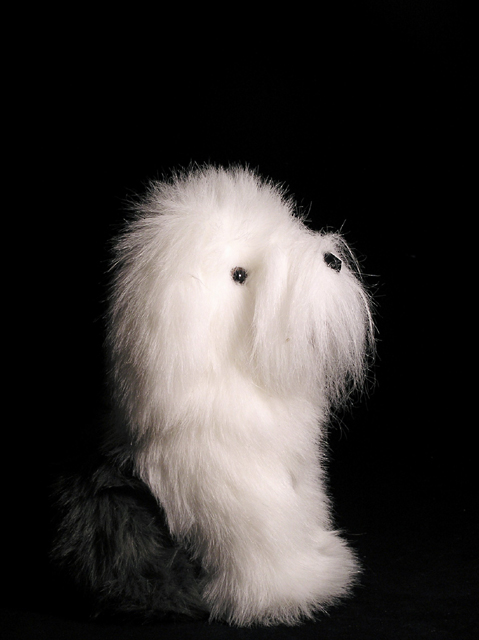
I am quite pleased with how this turned out. I wanted to get a catchlight in his eye and I got it.I think it gives him a bit more character. I am also pleased that the white was'nt over exposed.The info on aperture etc is just an approximation as the new way I upload my photos it is difficult for me to find properties.
Played with
Hi, as requested, here is an indepth critique of your submission.
First Impression - the most important one: Interesting enough, I saw the thread about this photo earlier and was going to comment before I got distracted. Well, here I go :-) Lovely lighting and cute pooch, but crop seems a bit tight.
Composition: I'd like to see this shot less tight. I really think that minimalizing the dog against more black background would have strengthened this shot immensely.
Subject: Clear and stands out well against the black b/g.
Technical (Color, focus, and light): All good on the technical side. I think the lighting is excellent, excepts for one hot spot above the eye.
To grow its vote?: Strengthen the composition some. Ofcourse there are also voters that HATE dog shots, I can't help you with them :-( I think it's cute.
Great job of lighting the fur. I actually like the negative space because it gives him more to look up at, in a way. Also I thought the title was really cute.
Just a quick comment. Gave a 5 during the challenge...I don't like long haired dogs :)
For me the picture is so much in profile that it seems a little two dimensional. It would seem, based on the catchlight that the camera and the light were in the same position. Rather than the light sweeping accross the little guy and providing some shadows/definition to his shape it blasted him head on leaving a flatly lit image. Your exposure is right on, just needs a little different direction IMO.
You did a nice job on cropping, the empty space above his head is nice. His darker hair does disappear which gives the impression of a floating white head unless you look closely. This may have hurt your score as well if some voters did not have their monitor calibrated correctly.
I'm jumping aroudn here but the other thing that comes to mind is... next time try to get a little light raking across the background resulting in a lighting gradient. This would have helped separate your subject from its background.
Picture is sharp, subject is cute. Keep shooting,
mark
edit: didn't realize it was stuffed. Is it??? "slap myself upside the head and walk away muttering"
For me, what stands out in a negative way is that we have lost most of the body of the dog. All we can see is the forelegs and the head, and just a hint of the rump in the shadows. It looks very unnatural to me. Lighting and exposure are excellent.
Hi Charlie, I would have probably voted "5" if I had voted. The only technical nit I see is that in my opinion there's a bit too much negative space above the little fellow. Otherwise the photo has only average to slightly below average appeal TO ME because of the subject matter. As far as photos of stuffed animals go, though, you did very well :o) Hope this helps. Ray
Hi. Saw your post in the forums so I decided to take a peek. Quite honestly, I've looked at this image for a couple of minutes now and I'm having a tough time finding comments to provide. The image is fine. Nothing really jumping out at me that I really find interesting (subject is kind of plain - nothing personal), and nothing screams out to be fixed. :(
Composition is ok. Exposure and lighting is very good. Ummm....what else? Maybe if you could have gotten below the subject's level - like elevate the subject on a table and shoot upwards a little to add another dimension and interest?
The number one most important thing you could have done to improve this photo is to not have used a stuffed animal. Here's a quote from something Scalvert wrote awhile ago...
"Can you substitute a stuffed animal? Well, no. Unless you can fool everyone into thinking it's real, don't even try it. Toys usually fail because they scream "amateur." Look at past entries that scored in the 3.5-4.5 range and you'll find them filled with whatever objects the photographer found handy around the house. Voters recognize a lack of effort and the punishment is severe. "
Is that tru 100% of the time? Not necessarily. But given that this is a straight studio shot with nothing else to really pull the viewer in, I'm guessing that's where it failed.
Your entry is well-lit, has good detail and nice catchlights. The composition is fine, although turned a bit more towards the camera might have helped a little.
lol - how funny - this stuffed doggies head seems a bit large for his tiny body. Wel done with the lighting and exposure values. You have kept beautiful detail in the whites without blowing any highlights





 Add photograph to your favorites
 Add photographer to your favorites

 Photographer found comment helpful.


