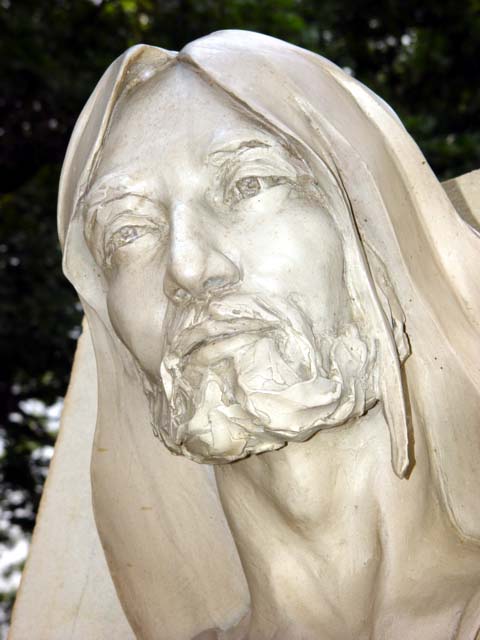
Well-composed and framed, I would have preferred more emphasis on contrast. There's very little color in this shot, I wonder if a sepia or warm b/w would have added to this. 6-ClubJuggle
I'm sorry, but this image doesn't do much for me...If I have to say something, it would be that I don't care for the brightness and the little shadows -just my opinion. Just being honest. Ruthann
Nice capture of this statue. Was this truly silver? On my display, looks more like white. (could that have been the name of the statue, irregardless?) 7 Swash
Great shot! It looks like you had to struggle a bit to remove somthing from the background (the diagonal on the left and the section right behind His head). It looks nearly the same color as His face. Maybe if you had moved a little more to your right and down just a smidgit it would have been eliminated? Of course I have no idea if that was possible or would have helped. Great shot none the less :)
This is a good composition with good exposure and contrast. Generally it is considered "recycled art" to photograph the art work of someone else unless the photograph itself has an artistic quality that goes beyond an accurate recording of the original art piece. I lean toward this line of thinking and as such, give high marks for the quality of the image, but lower marks for creative artistry.






 Add photograph to your favorites
 Add photographer to your favorites


