Little bit fuzzy, but I know it's hard with this kind of image to achieve sharpness. Also, I know this is negative space challenge, but sometimes less is actually more.
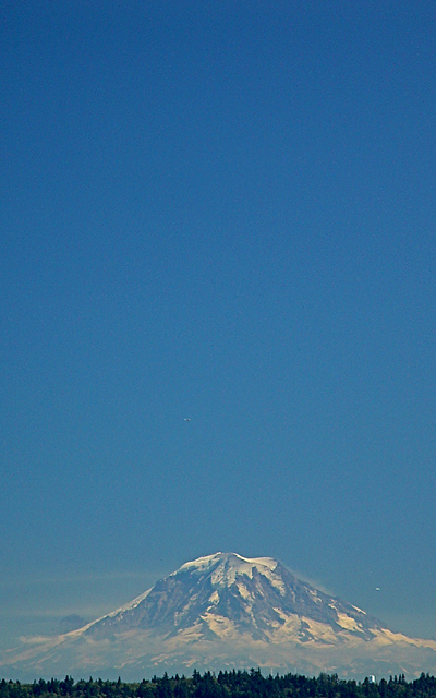
The bottom part is really cool. I think you have too much space on top and also the sky seems to be banding or pixelating, or both. Oversaturated? Maybe... Good luck. Good shot.
the vast sky makes this massive mountain seem like a bump in the horizon - great juxtaposition. I think there is a bit too much sky however, its just a shade off balance..maybe if you shaved off the top cm of sky? :) (not that that is a great complaint, its still a fine shot!)
Ilike what you ahve done with this image, espcially croping the foreground trees. I agree that this fits the challenge, but Mt. Rainier is a magnificent mountain and should be more prominent in any image of it.
Pretty shot. I really didn't need all that sky to get the point across. Less is more. The mere fact that this picture has a beautiful 3D quality would have been enough. Cropping two thirds of the way down would have been just as efffective.
Not being able to vote, I almost didn't take the time to leave a comment on this, but I have to tell you, this is one of my favorites of the challenge. The only things I don't care for is the little white thing in the lower left by the treeline (looks like a water tower or something) and the white spec to the right of the mountain (looks like a plane maybe). I'm sure you had no choice but to have them in the shot, but the peak itself is so beautiful and natural, it's a shame to have seemingly man-made items touch the scene. Despite that, if I could vote, I would give you a 10. I absolutely love this.
Nice shot. I like the composition. Meets the challenge. Only thing is there are some white spots on the right and near the bottom that I find distracting but I\'m nit picking. I really find this shot effective. Good luck.






 Add photograph to your favorites
 Add photographer to your favorites


