Hi, as requested, here is an indepth critique of your submission.
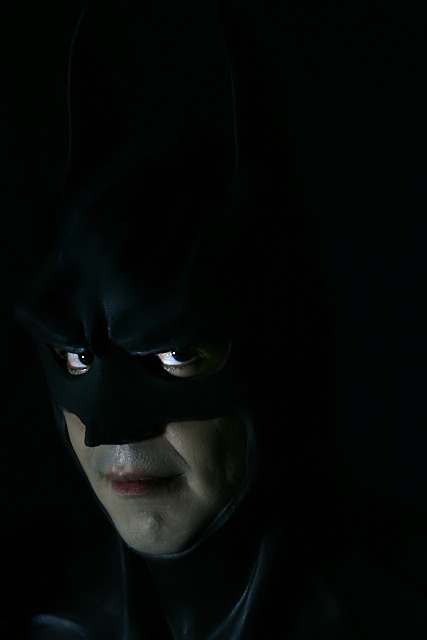
First Impression - the most important one: Fun concept, but lighting comes across as a bit on the green side.
Composition: I appreciate the use of negative space, but I think it should be in front of the subject rather than behind the subject.
Subject: Clear in your face composition, subject is well defined by the lightsource.
Technical (Color, focus, and light): Color: As mentioned earlier it seems a bit on the green side.
Focus looks sharp.
Light: Very good, it illuminates just what you wanted illuminated.
To grow its vote?: A little stronger composition would have helped some. Not sure a "batman" theme would score real high in most challenges though.
Summary: I like it. It's fun and nicely done. Keep up the good work.
Nice idea. The image could be brighter in my opinion especially the details in the shadow areas, which the calibrated-challenged might not be able to see.





 Add photograph to your favorites
 Add photographer to your favorites

 Photographer found comment helpful.


