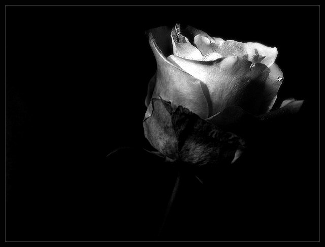
not sure how this is going to do. kind of harsh lighting.
Editing:
Brightness/Contrast
HMS Adjust
Cloning in the top left corner
Resize
Curves
Brightness/Contrast
HMS Adjust
Dodging/Burning
Sharpen
Soft Focus
USM
Sharpen
Soft Focus
Sparpen
Border
Save for web
Statistics
Place: 31 out of 238 Avg (all users): 6.3361 Avg (commenters): 7.6667 Avg (participants): 6.3889 Avg (non-participants): 6.3140 Views since voting: 1528 Views during voting: 333 Votes: 244 Comments: 16 Favorites: 0
Welcome to DPC and congrats on a great first entry. I dont think the lighting is harsh at all. It highlights the tips well and gives great shadows deeper within the flower. You captured good detail overall and you met the challenge requirements with flying colors (or lack there of).
The water droplet seems a bit out of place. It is quite pronounced and all alone with no other droplets to be seen. The black and white treatment is great. Might be interesting to see a lightly colored version but I dont think I would have changed it for this challenge.
I personally like the negative space on the left and I have no problem with the border. You have a great first pic entered here. Your score seems about right and you just cant complain about a top 40 your first time around. Congratulations and I look forward to seeing what else you have to offer. Good luck in the future.
Very nice expression of lighiting. I like the composition as well. The single droplet draws more attention than I think it should, IMO, but that is minor.
Almost a beautifully exposed image - well, it may well actually be, but you've allowed so much negative space that the full area of interest of the image is reduced to a very small dimension. There is certainly something to be said for some bretahing-space in the framing of any object, but that raft of black seems unneccesarily much to me - and it has a down-side: with more flower, we'd see more of what gives the impression of being a finely detailed controlled exposure, worthy of a longer look. Also, here, the real eye-catcher of the frame is that brighter, higher contrast part of the bloom, and that is, perhaps, just a touch too centre of frame? Or perhaps even just a more diagonal composition would have sat more happily - I'm just finding that composition a bit discomforting.
My first feeling was that this was a bit dark - but the longer I lok at it I think the lighting is actually just right. Nice details brought out by the lighting. Good focus.







 Add photograph to your favorites
 Add photographer to your favorites

 Photographer found comment helpful.


