Not much time to choose. 5min to the deadline. No time to look through the rest of the batch. Picked one and just went with it. Hope you folks like it :)
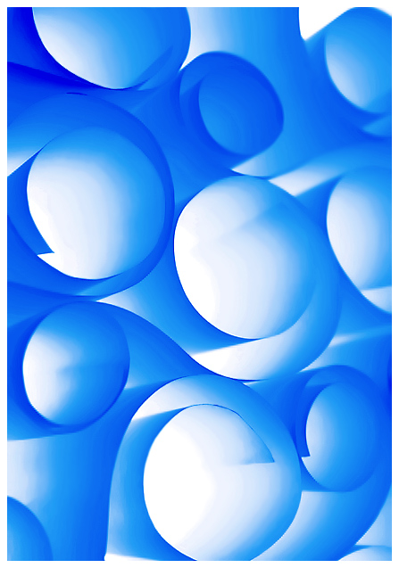
Lighting details: in a plain regular heavy plastic milk crate (could use a cardboard box, which I actually didnt have handy but a 100w light does heat up so then safety concerns do come to mind), put a clamp lamp inside pointing up then a piece of frosted glass on top (borrowed from a shelf). In the end , it's like using a softbox as a setup table and arranging the pieces right on it. So in turn the end result should be that the soft light is illuminating the objects from below.
PS: saturation boost, changed hue to get the blue color, levels/curves for contrast, rotated counter clockwise, cropped, resize, noise reduction, sharpened.
Was inspired by Barry Walthall's work to give this a try. Hope to try more of these in the future.
--
Thanks to everyone for their comments. Really appreciate it.
Some of the outtakes I didnt get to look at during the posting period. Where processed after voting began
My favorite:
Statistics
Place: 6 out of 238 Avg (all users): 6.8977 Avg (commenters): 7.8276 Avg (participants): 6.8182 Avg (non-participants): 6.9305 Views since voting: 4906 Views during voting: 453 Votes: 264 Comments: 40 Favorites: 15 (view)
Camera Work/Technical: This is a very interesting image that appealed well with the voters. Perhaps it is my aging eyes, but the focus seems a little soft to me. Very nice post-processing to render an image that the voters would love.
Lighting: Near flawless, and this, of course, is the strength of the image. The lighting you chose for this setup made for a terrific textured feel.
Composition/Content: Excellent, as well. The shapes play together very well to keep the viewer's eye moving throughout the entire image.
My Opinion: You created a very appealing, vibrant image that the voters loved. Congratulations on yet another top ten finish.
I love this type of photos and colors are great! I just wish that the edges of the paper were a bit sharper, especially in the top right corner -- I think the impact would have been much stringer that way.
Nice. Tighter curls might have meant for smaller expanses of white. Good though and I hope you give details cos I tried this once and failed miserably.





 Add photograph to your favorites
 Add photographer to your favorites


 Photographer found comment helpful.


