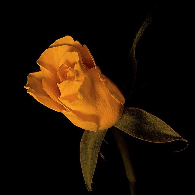
Yes I know it is YET Another Flower. I have seen these before and thought I would try it myself.
Setup:
* borrowed a rose from my daughter
* dark room with a desk lamp as light source
* covered desk lamp with translucent plastic packets to soften the light
* black poster board on the wall about two feet behind the rose
* lots of patience because of the long exposures
Postprocessing:
* Sharpened first because I wanted to try contrast masking
* Contrast mask (duplicate top pixel layer, desaturate, invert, overlay mode, Gaussian blur, adjust opacity)
* Spot edit layer to remove a couple of small imperfections on the rose
* very little dodge & burn using a soft light mode adjustment layer
* aggressive levels adjustment layer because there were almost no highlights ... I did not want to chance the yellow blowing out
* hue / saturation adjustment layer to push the yellow slightly, but masked to exclude the leaves
* adjustment layer in multiply mode to darken but masked to exclude the leaves (they aren't leaves ... are they?)
* resize image
* save for web
* upload
Guesstimated Score: 5.5 to 5.8
Statistics
Place: 53 out of 238 Avg (all users): 6.0820 Avg (commenters): 7.1429 Avg (participants): 5.9733 Avg (non-participants): 6.1271 Views since voting: 1201 Views during voting: 331 Votes: 256 Comments: 16 Favorites: 0
First of all, congratulations on a good finish with this image. You scored higher than your prediction :)
First impression: It's a beautiful rose. The stem in the background is rather distracting (as the images load top to bottom, you get to see the stem first, before seeing the rose).
Focus: Right on. No problems here.
Exposure: Again, seems just right for this image.
Lighting: Looks to be quite good, although the rose does not look yellow, but orange, and that might be due to the desk lamp light (incandescent?). A different white balance might work better in this situation. Your contrast masking probably changed the whole thing a fair bit.
Composition: Quite good again, the stem in back is not needed IMO, and the bottom leaf looks to be cut off ever so slightly. Hard to tell if not cutting it off would change the image much or not. The flower looks rather leathery, not delicate at all. The orange on black with hints of green is beautiful.
Overall: A solid, well done entry, with a good score.
Very nice lighting. The yellow and green look a bit off to me probably due to the type of lighting you used or white balance. If that was intentional then just forget I just said that. :) Either way it gets a 7.
very nice... maybe since this is advanced editing, you could have played around with getting rid of the back leaf and cropping the pic lower so as to not cut off the bottom leaf.... fantastic photo! 8







 Add photograph to your favorites
 Add photographer to your favorites


 Photographer found comment helpful.


