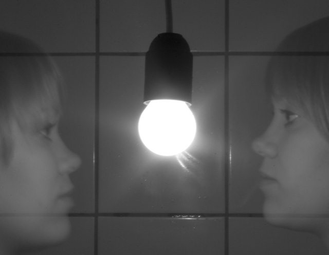
The model is my girlfriend Vala and my girlfriend Vala. The shot was taken in 10 seconds and I turned the lights off while she moved to the other side of the light bowl and that’s why the face is a little bit blurry.
Desaturated, cloned a few spots hear and there and that’s it.
Statistics
Place: 179 out of 238 Avg (all users): 4.9136 Avg (commenters): 6.2000 Avg (participants): 4.6883 Avg (non-participants): 5.0181 Views since voting: 888 Views during voting: 346 Votes: 243 Comments: 7 Favorites: 0
Camera Work/Technical: This is a very neat idea, but the entire image looks a little soft to me. I think that most of it may have been your desaturation technique. The blur in the faces works fine and actually adds to the ghostly feel, but the rest of the image could stand to be a bit more crisp.
Lighting: Nice choice for lighting choice, but your tonal range is very flat. Again, most likely from your desaturation technique. It looks like you simply converted this one to grayscale. As it is, a strong s-curve in a curves adjustment layer would help out a great deal. If you are using Photoshop, give the Channel Mixer a shot. While everyone has their own settings, 45%/32%/30% works pretty well for skin tones.
Composition/Content: I like the centered composition and the mirror feel that you created. Everything looks nice and straight. The only change would be to try to get her level on both sides of the frame. That sounds good, but may be a lot more trouble than it's worth.
My Opinion: You did a very nice job meeting the challenge, but this one lacks the needed pop to vault it into a higher scoring range. The one single change to make to this particular shot would be amping up the contrast. That alone would pull a much better score.
Given the advanced rule-set's lack of restrictions, I think some work to increase the general contrast of this shot might have helped you: the transparency of those faces is made by the lines appearing through them, not the washed-out quality, and anyway the image is just too generally grey for big impact.
Interesting concept. Up that contrast!
Also, it would be cool if the girl had something different about her on each side. Different aspects of her personality - like a good vs. evil type theme.
Just a thought :)
The gray tones look very muted here. I would try using the burn tool on the shadows and play with curves a bit to bring out more of the shadows giving it contrrast without making the light source too harsh







 Add photograph to your favorites
 Add photographer to your favorites

 Photographer found comment helpful.


