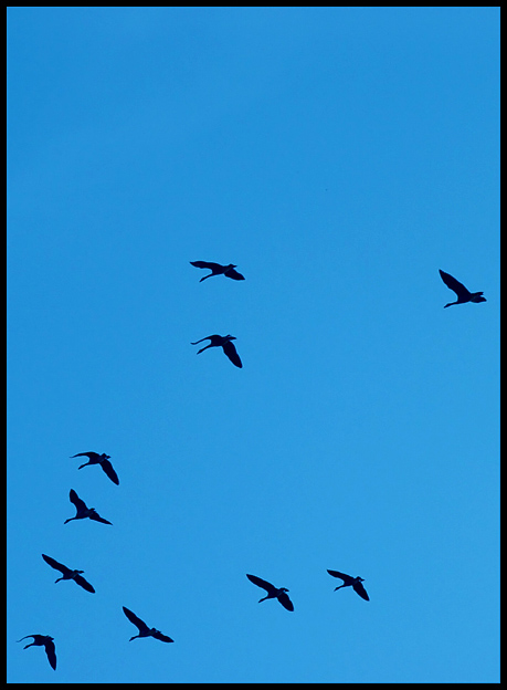
Excellent use of negative space. I like the composition and the colors. I wish there was a bit more contrast to darken the birds a bit, but that doesn't detract from a solid 9.
Perhaps the space at the top was kept intentionally but I would much prefer to have it some of it cropped off to bring more attention to the 'V-shape' form of the birds as I feel that the birds inthe middle of the image are the real subjects when I find the "V" is much more interesting.
I can't put my finger on it. I think maybe if the negative space was ahead of them, in the direction they are facing, that might work better. Nice catch though.
Very nice. Definitely a great use of negative space. The blue of the sky is a little unappealing on my monitor - not quite sure why. Makes me want to see this in black and white and see if that would make it more dramatic.





 Add photograph to your favorites
 Add photographer to your favorites


 Photographer found comment helpful.


