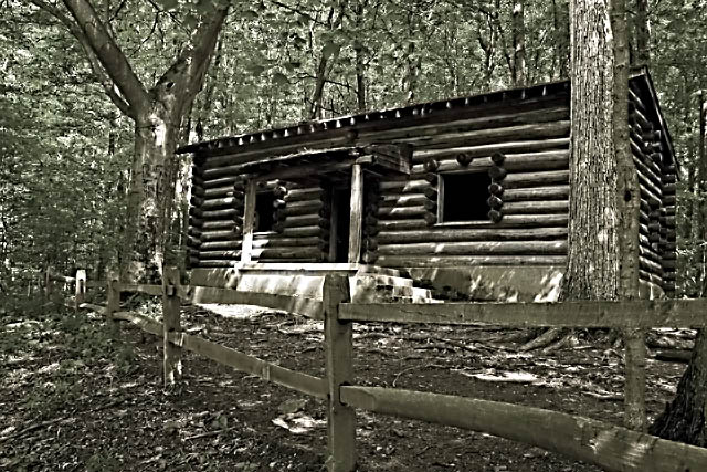
this is a nice image, but as an architecture shot it's really not working, and the score really shows that.
that big tree on the right side blocks the view to the cabin, something that is a big no no in architecture shots, and the cabin is to small part of the image, should be at least 80-90%.
the colors are bad, you can see some color, but really can't tell wich color you see, they are so vague, either boost up the colors or desaturate completely.
Looks like you are starting to play around a bit more with your postprocessing. The shot has a very odd feel to it. A bit overprocessed that makes it almost feel like it is moving. Possibly oversharpened or a bit much contrast. I think the log cabin fit the challenge well and in a welcome different way, but PP hurt it bad.
I liked the idea of the cabin in the woods as "architecture" and thought the cabin itself was sharp enough, but a bit dark. What troubled me about this photo, though, was the confusion I felt because the background appeared to be heavily processed and competed adversely with the cabin itself. There is not much difference in tone...much of the photo has a similar cast to it, so my eyes never got to rest anywhere. The background seems to be too strong IMHO.
Trading post...
I like the coloring of the photo but it looks overprocessed somehow. Maybe too much sharpening? The fence is distracting in that it keeps pulling your eye away from the house. The effects from the sunlight filtering through are great. You should post the original in your portfolio so we can see the diffence before processing.
Composition/subject I do like the subject and the composition pretty good, especially with the fence providing a nice line. But I think I'd like to see more above the house - at least enough to give the chimney a place to end.
Technical It almost looks like a watercolor, but lacking in a bit of color. Not sure what your post processing was - you need to add that info in the comments. :-)
Meets challenge I suspect some might not see this as "architecture" but more of a building style. I think it meets the challenge, though.
My opinion I gave it a 5 in voting. I like the dappled sunlight and the simple structure, but I'm not sure about the processing.
Composition well composed along the rule of thirds, but the fence draws your eye away from the subject to nowhere in particular.
Technical stuff (exposure, dof, lighting etc…) Seems very dark, not sure whether this is underexposure or poor monotone conversion.
Meeting the challenge An interesting take on architecture, but meets it fine.
Post-processing Seems a little oversharpened / too much contrast, especially on the house and b/g foliage.
My personal opinion There's something gone wrong either in exposure or postprocessing, and looks v dark and contrastey. Would have probably voted a 4 (sorry :/) Not one of your best





 Add photograph to your favorites
 Add photographer to your favorites


 Photographer found comment helpful.


