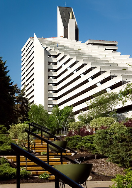
Overall, this is a lovely photograph of a very interesting building. The composition has managed to include several intersecting angles that satisfy, such the bannisters vs. the stairs, as well as the various opposing lines in the structure. The angles also all seem to draw one into the centre of the image, which is generally a desired effect. Light is good, serving to make the subject pop out of the image well.
In my opinion, for maximum impact with a subject like this, depth of field should be inclusive of all elements in the frame, and so the soft bannisters, soft foliage, and soft angular structure at the top of the building all detract for me somewhat. I think I would have preferred less of the foliage, and more of the structure, so getting right up to the building may have had more of an impact. However, it could be argued that then your angle would have resulted in the mostly unattractive "tilting" effect of shooting up at an architectural structure. I think because of the number of elements here, the stairs, trees, and building, the result is a tad cluttered, and for me lessens the impact of an otherwise fine photograph.
Novel idea, but the out of focus handrails in the front distract from the image. Showing more of the image in frame and less of the surounding extras, would have make this a stronger image. does not clearly show architecture in my view.
Fascinating building. To my eye the photo would have been much better if the dark trees on the left had been cropped away. They pull my attention away from the building.
Using a new formula....
Meets the Challenge = 2
Technical Merit = 1 (prefer the railings to be in focus)
Holds Interest = 1
Creativity = 1
The "wow factor" = 0
Final score: 5





 Add photograph to your favorites
 Add photographer to your favorites

 Photographer found comment helpful.


