Hello from the critique club,
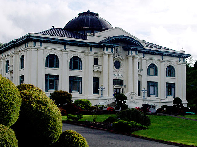
A nice image of a beautiful building. FOr the challenge, it most definitely says 'architecture' to me.
I like your angle and composition very much. I like how much of the front lawn you chose to include, so that the building occupies the upper part of the frame. It makes it feel even more dominant and powerful, appropriate for a courthosue. I especially like the shrubs in the corner. It leads the eye into the frame very nicely.
I like the perpective you chose, with the building at an angle. I think it would have been nice tohave the rear corner of the building in the frame. IT feels a little unbalanced with it cut off like that.
The building seems a little underexposed. In curves, I think if you bring up the midtones and especially the quartertones, the building will pop more. You will have to mask the sky or it will blow out, I realize.
Please feel free to pm me with any questions about my comments.
Cheers,
Liza |






 Add photograph to your favorites
 Add photographer to your favorites

 Photographer found comment helpful.


