Hi, as requested, here is an indepth critique of your submission.
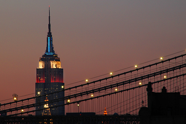
First Impression - the most important one: Very nice shot. I particularly like the colors of the sky and the leading lines of the bridge. This is a postcard shot for sure.
Composition: Works well with the position of the building and the leading lines of the bridge.
Subject: Composition has done everything for you to highlight the subject.
Technical (Color, focus, and light): Color looks good, I really like it.
Focus is sharp, but you may have over-sharpened it just a bit in post-process.
Light looks good, but the sky is just a bit noisy. If you had selectively blurred that noise, I think voters would have raved over this image.
To grow its vote?: That noise issue in the sky for one would have helped. Other than that, I really can't think how you could have improved this photo much.
love the lines here. The muted sky is nice, too -- helps set off the black lines of the bridge cables and building silhouettes. I hate to say it, but the Chrysler Building sort of takes away from the overall effect by sticking out like that.





 Add photograph to your favorites
 Add photographer to your favorites


 Photographer found comment helpful.


