First, let me say that I am not a professional or even a very good amature photographer, so you may want to take my comments with a grain of salt.
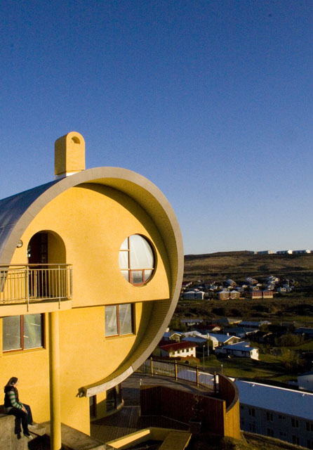
I like this photo an awful lot. The colors are vibrant and I like the perspective. The person sitting at the bottom left gives a good size perspective. It's a unique shot and definitely a unique piece of archetecture.
However, I think the context you put the house in may have cost you a bit. Because this is an archetecture challenge, I think that the green land and houses and that the sky should have been cropped to be smaller, to put a greater impact on the building. A front-on angle may have helped too.
That being said, though, I think this photo has a great context, a great crop... I really do enjoy looking at it and I think it is a wonderful photo. It is one of those cases where it may have scored much higher in a different challenge (but of course, that is hard to predict). The things I suggest as improvements - the front angle or the cropping of sky and land - are improvements not to this photo but to this photo in this challenge, and these are two separate things.
Another note: the filesize should be as close to 150kb as possible to minimize compression artifacts. If you use Photoshop and are having problems, you can PM me - I know a lot of people have struggled with this at first.
I think you've done a great job since you have been here at DPC. In my opinion, you have a great grasp of color and composition, and despite what you said on your Burned Toast entry, lighting. In regards to the lighting, you may have to work more on controling your inside light, but with your outside shots so far I have seen good examples of using light. I hope all that makes sense. :-)
I look forward to seeing more from you!
I hope this helps! Feel free to PM me if you have any questions.
Hef alltaf fundist þetta forvitnilegt hús þó er þessi mynd ansi meðalmannsleg eitthvað. Alveg rosalegt noise í himninum líka. (I'm pretty sure this picture was submitted by an Icelander, if not then ignore this comment)
A little post processing would have helped. A bump in contrast, a little noise reduction on the sky. The pic is also tilted, a slight rotation would correct it. Horizone almost in the centre is not a good point. IMO.
Otherwise a pretty good compositon. Good luck!
You could have gotten a lot better shot of this house than that. I don't like seeing the other houses in the background. I think it's a too complicated composition. Try to make it simple next time. 5 for being Icelandic :)






 Add photograph to your favorites
 Add photographer to your favorites

 Photographer found comment helpful.


