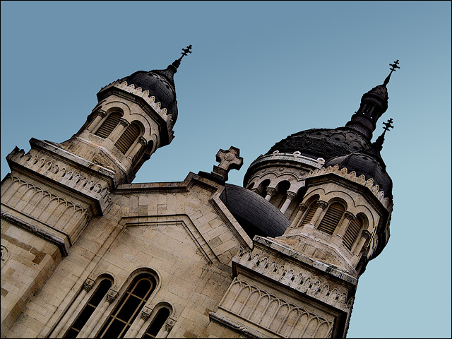
Wow! My first member challenge. In the photo you can see a part of the Orthodox Cathedral from Cluj-Napoca(the city where I study).
The sky was flat so I had to make a gradient to give the photo some depth. I hope you'll like it.
Statistics
Place: 170 out of 281 Avg (all users): 5.3913 Avg (commenters): 5.7000 Avg (participants): 5.3981 Avg (non-participants): 5.3827 Views since voting: 976 Views during voting: 247 Votes: 184 Comments: 16 Favorites: 1 (view)
First impression: I like the tilted shot! Then I immediately recollected recent threads about leaning photos, and realized that this community perhaps does not enjoy tilted photos.
Second thoughts: Tilted is fine, but it is lacking in height. These cathedrals are usually taller, and your landscape orientation prevented you from showing more of its architecture.
Amanda commented on the gradient, that it should have been more prominent. However, when adding a significant gradient to a sky that did not have any to begin with is walking a thin line between legal and DQ. However, your gradient should have been parallel to the horizon and not to the photo's horizontal (or it seems to me that way).
Also, to do better in a challenge (and you probably know this by now) you need a more striking photo. Compositionally and subject-wise, this is just another church (and tilted, which polarized your audience). You received slightly below-average score for it.
I hope this helps! Please feel free to PM me if you have any questions.
well, I commented on the tiltedness, but also, I see you added a gradient, I was going to suggest that, maybe your gradient should have been a little more dramatic and a darker blue, seems a little grayish still, focus and color on the building look good, crisp and interesting
Using a new formula....
Meets the Challenge = 2
Technical Merit = 2
Holds Interest = 1
Creativity = 0
The "wow factor" = 0 (hate that "lean")
Final score: 5






 Add photograph to your favorites
 Add photographer to your favorites

 Photographer found comment helpful.


