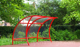
The image really needs to be larger. Colours work nicely, but the (almost) central composition is fairly plain. It needs something to add a little interest.
Need to look at composition and subject better. The curve of the bus stop has a nice line and color, but it may be too centered. Image could be bigger. What do you have for an editing package? There may be a way to get the images bigger.
"Using Photoshop to Prepare Photos for DPC Challenges" This guide located under the pull-down window Learn will help you immensely with resizing issues, especially if you are having the same types of challenges I had when I first entered these contests.
I share that with you because of the lower scores you will consistently receive with entries that are only quarter-size.
Now with the critique of presentation over...Please be encouraged that I find this to be a very attractive red back-stop on a soccer field... apparently. The strong red plays well against the mostly-green dappled background. Kudos on being unique! :)
The image is a little small. Using the full size allowed would help. Colors and lighting look good. I'm just not getting architecture out of the bus stop.
Picture needs to be larger. There are some interesting lines and curves here, and I think you should have concentrated on them as design elements rather than giving us a pciture of a bus stop against a green background.





 Add photograph to your favorites
 Add photographer to your favorites


 Photographer found comment helpful.


