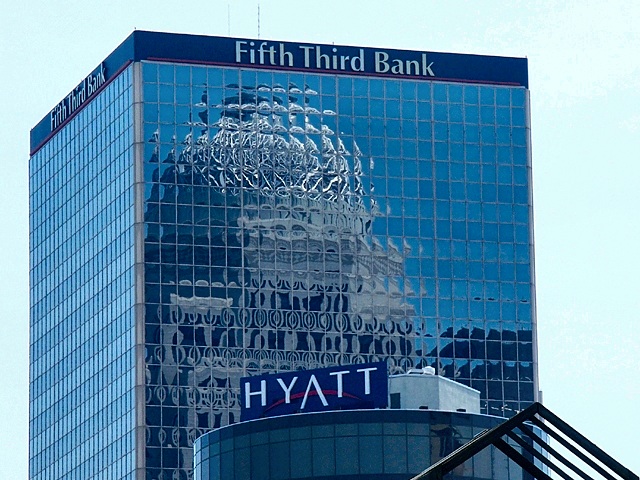
Would have looked better if you could have cropped out the "Hyatt" and the "Fifth Third Bank". The building titles are very distracting. Great concept though.
In general a well exposed refection capture. Nice resolution and focus. Could use some more pop and would work better without the distracting bottom elements.
Haven't I seen this building before (previous challenge? too lazy to check) Nice shot, interesting window distortion. Looks like they hurried the building construction. 7 Swash
I like the theory, but dislike the Hyatt sign and that black thing. If you could have cropped those out I would have rated much higher. good job. cthenk
I would crop everything but really interesting reflection. I don't think sky, shape of the building, banner, and most of all triangle in the front improve the image in any way.
I love the reflection here... this is nice :) the triangular arch at the bottom right doesn't seem fitting, but I know that this image couldn't exist without it... = 7 - jmsetzler
I like this and would of ranked it higher but the 'Hyatt' section could of been left off.....it adds nothing + the text of the bank is just too much. Still over all I do like this shot, creative work. Kee





 Add photograph to your favorites
 Add photographer to your favorites


