Hi, as requested, here is an indepth critique of your submission.
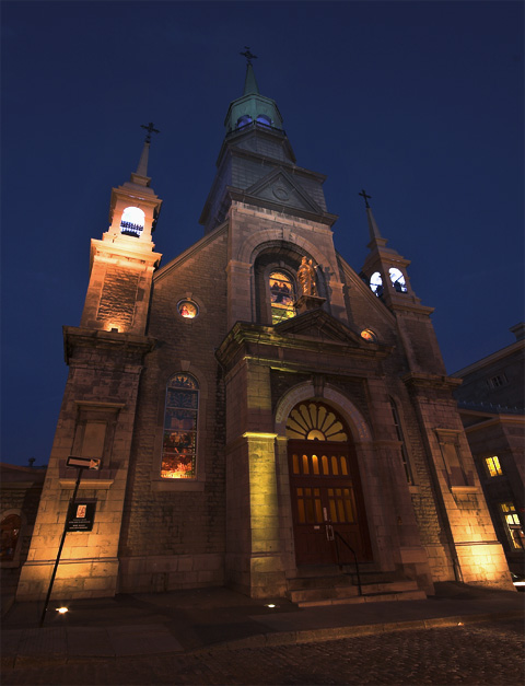
First Impression - the most important one: Love the wide lens look on this one. :-)
Composition: I'm not real fond of "falling" buildings. I think you could have minimized this with perspective and distort in photoshop and gotten a higher score for it.
Subject: Subject is clear stands out well from the background.
Technical (Color, focus, and light): Color - It has a nice nightshot look.
Focus looks sharp.
Light- I have issues with the blown highlights on the left tower, but overall it is good. If you shot in RAW, you might have been able to deal with that tower a bit more.
To grow its vote?: I'm thinking the leaning buildings were frowned upon in this challenge. They do tend to make people feel a bit uneasy at a psychological level.
Summary: Nice work overall, I do like this shot. I bet you are loving that lens. :-)





 Add photograph to your favorites
 Add photographer to your favorites


 Photographer found comment helpful.


