Very nice but your lighting stole away details, of wich you could have captured incredibly well, i note here that people vote on creativity or different compositions, instead of techs, wich is different! ;0)
i think this is beautiful, but, it lacks the details that one would like to see with clarity on the buds. Good job just the same!
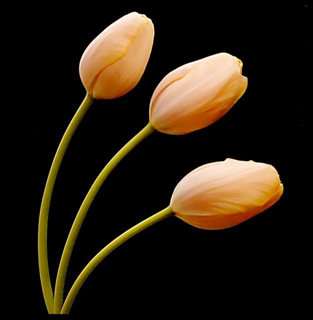
Beautiful shot - lovely color tones and leading lines/curves. Very appealing visually and effective use of black background to emphasize your subject. I didn't vote in this challenge but would have probably scored this an 8. The only things I see that I would try to improve are a couple of spots in the background (easily cloned or blended out) and a little stronger focus on the actual tulips themselves. Well done. Love the peach color.
The first thing I notice about your image is the fantastic use of colour. The expanse of black as a background does not over-dominate, but enhances the soft pastel shades of orange and green.
The three flowers are beautifully placed. There are lovely curves that converge to one point at the bottom of the image, with lovely negative space in between. This gives a feeling of calm, serenity and beauty. There is an overall balance in the composition that is really pleasing on the eye.
Theree is lovely contrast between the lighting on the top and bottom of the tulips. I do though find it a little harsh on the bottom flower, but not so much that it spoils the image for me.
The image is very soft, and I would loved to have seen a just a little more detail in the petals. There is though more of a hint of texture on the the stems, which is nice.
I also think such a lovely image deserves more than the title 'Tulips'..I would have called it 'Threelips' or 'Trinity':))
This a top pick of mine for this challenge thus far. Very classy photograph. The colors and lighting are right on the money and the contrast of the dark background works well here.
Intriguing; very strong graphically, although i wonder about the black border - useful at the top of frame, perhaps, but the un-exoected cut-off at the bottom is perhaps more intrusive than i think you intended. There's also a graininess - a very fine graininness, but nevertheless present - which to my eye doesn't quite fit with the highly-controlled set-up here. It might just be a black--point theshold thing - the descent into pure black from the mid-tones seems very sudden, looking carefully at the stems of the blooms, and that makes the tonal graduations of the more shaded areas of the flowers lack that sense of smoothness.
nice still life image. Lighting seems a tad bit bright on the tulips, and the focus just a bit too soft. I have seen similiar shot to this often - each time I wish it had been done with the tulips at different stages of opening.
Everything is great about this photo but the arrangement looks a little artificial. I feel uneven gap between the flowers would have given more natural feel. Still a great capture. Hope this does well for you.8.






 Add photograph to your favorites
 Add photographer to your favorites

 Photographer found comment helpful.


