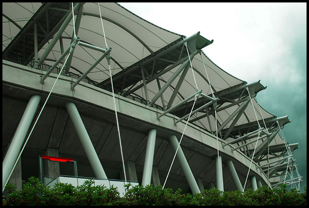
Taken on a drizzly day at the stadium in the town where I live. The stadium was built for the 2002 World Cup in soccer, when it was hosted by Japan and Korea.
Worked on the photo in 2 separate layers so that I could darken the sky. On the rest, did some desaturation and deepening the red on the sign.
Statistics
Place: 194 out of 281 Avg (all users): 5.3027 Avg (commenters): 5.6000 Avg (participants): 5.2330 Avg (non-participants): 5.3902 Views since voting: 953 Views during voting: 235 Votes: 185 Comments: 7 Favorites: 0
I think this is a very creative shot- I like the dark greeny-blue of the sky! Also, the triangular shapes really add strength to the photo. The only thing is that my eyes don't know whether to focus on the red sign or the edge of the building on the lower right hand side. It's definitely underrated.
This is your Architecture III shot. Definitely meets the challenge. I think this is a good choice of subjects. There are some interesting lines and shapes formed by the supports of the structure. Technically, looks pretty good. Very good focus. Looks like the weather wasn't cooperating for you :-) The image appears to be just a touch on the flat side, but not too bad. A little bit different lighting conditions perhaps could enhance the photo. It looks like you were going for the dramatic sky. It can be tough trying to capture the perfect conditions within the time frame of the challenge :-) I really like the sweeping curve composition that you've chosen. It makes for a nice 'majestic' vertical across the image, very fitting for this subject, IMO. Although I like the overall composition, I think there are a couple of minor things here that may be holding this photo back. Including bushes, or foliage, especially as a 'framing' element can be a big positive, in this case, I'm thinking that with this building, and especially in the context of this challenge, the bushes don't seem to be adding to the shot. And also, as one commenter pointed out, the red sign I feel is detrimental to the overall presentation here. Splashes of color like that can be great in a shot a lot of times. But here, we are looking at this cool, interesting building, trying to stress the fine architecture, but the eye is strongly drawn to this little red sign, which doesn't really compare to the interest in the structure. I think the same basic shot, from maybe a slightly different POV, eliminating those two factors (bushes and sign) could make for a little stronger presentation in this case.
Overall, not too bad though. A great subject. You've got some nice stuff in your portfolio. I like your leading lines photo, the one of the boy at the window, all in red. And I like the feet one too :-)
If you have any questions or comments or anything, please feel free to contact me.





 Add photograph to your favorites
 Add photographer to your favorites


 Photographer found comment helpful.