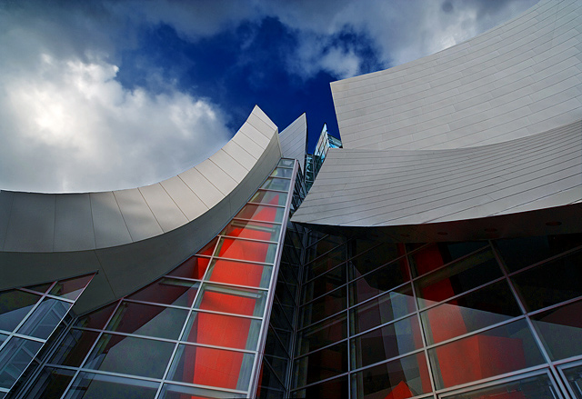
The shoot went better than I thought...I'm glad it wasn't sunny. Something weird happened to some of the panels and they looked a little off on the edge of one of the panels, so it took a while to clean up. Other than that, lost of adjustment layers, velvia, etc. I made the colors a little more vivid than in real life. Hope the purists don't mind.
Statistics
Place: 9 out of 281 Avg (all users): 6.9267 Avg (commenters): 8.0000 Avg (participants): 7.0481 Avg (non-participants): 6.7816 Views since voting: 3590 Views during voting: 331 Votes: 191 Comments: 35 Favorites: 1 (view)
Will you send this picture to me. i got a new mac and i want it as my background. i hope you got the email i sent to you not to long ago. Noahsgoldman@gmail.com. You have gone to a whole new level with ur photography.
My first impression is that this has beautiful color. I love the red against the blue of the sky. Very great job with the color. I think you achieved what you were trying to do there.
I keep drawing the top scoring shots here, and don't have much to add in the way of improvement. I can't see anything I would have changed here. It's a nice abstract image of an abstract building. Maybe I would have had the point at the top be not directly in the center of the photo? Or maybe put some kind of dramatic spin or angle on it? Nothing really wrong with the way you have presented it here, but just some things to try anyway.
Focus is right on. Great crispness and sharp lines throughout. Beautiful sky.
Maybe the shadow on the left could have been slightly smaller somehow? Maby taken at a different time of the day, but the shadow does not distract from the overall shot in my opinion.
Nice shot, nice score, nothing more to add.
~Heather~
Unlike many Frank Gehry designs, this one doesn't look like it's caught in the act of falling down. This photograph is a very fine tribute because I imagine it depicts exactly what M. Gehry had in mind when he designed the building; soaring, concentrated, and just a little bit organic. And a celebration of form over function, of course. 7.
Great choice of buildings, the sweeping architecture leads the eye through the shot. The contrast between the dark sky and red in the windows is a real boost, too. 7
How wonderful how the spot of blue sky lined up with the swoop of the roof - good eye! I like the red and the blue - so bright and contrasty -yet second to the fabulous white shapes on the roof. Very dynamic composition. Great exposure, focus... 9






 Add photograph to your favorites
 Add photographer to your favorites

 Photographer found comment helpful.


