there are a few flaws that makes this a bad architecture picture,
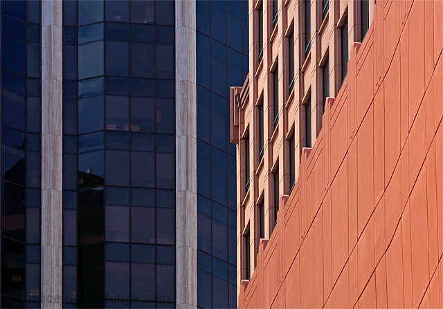
composition is bad, the image splits to close to the center, the building in the background covers more than 50% of the frame and is therefore the main subject, even though I think the building on the right should be the main subject.
you show to small part of the building for it to be recognised, it's ok to show a small part, but that part must have something really special for it to work, and something unique so you can recognise the building from that small part.
lighting is good, no harsh shadows on the red building.
there are a lot of lines, vertical, horizontal and diagonal, wich makes this image so much better than if the walls were smooth.
I think your score is fair for an image like this.
Trading post...
Nice use of colors. The lines are very crisp and uncluttered. This photo would stand on it's own without the challenge which I think makes a photo great. You could see this on an office wall. Great job.
Composition/subject I rather like this composition - I like the use of the two strong leading lines, and the pattern in light orange above the darker orange. The complementary colors play off each other nicely, too.
Technical The lighting works well for this image - no harsh shadows which gives more strength to the architecture itself. A possible suggestion would be to see if you can darken the blue building a bit to either get rid of or tone down the stuff you can see inside the windows.
Meets challenge Yep, meets challenge! Some may not have seen it as very exciting architecture, but as I said, I like the way the two buildings play off each other.
My opinion Might not have appealed to the masses, but I like it!
Composition Very nice shapes/angles, maybe would have suited a slightly tighter crop on the righthand side, so the transition wasnt right in the middle. Whilst I love all the lines and shapes and colours, the angle does make the righthand side a little busy (aat 640*480ish at least) just because there is so much detail.
Technical stuff (exposure, dof, lighting etc…) Exposure and lighting seem good, I like the brightness of the reds against the duller blue glass.
Post-processing n/a, all is fine and dandy imo
Message/atmosphere portrayed very nice study of shapes and colours, with the juxtaposition of different styles of architecture
Meeting the challenge Nice take on architecture - a real study of details rather than "a picture of an impressive building" (for example)
My personal opinion This was underrated by far - I didn't vote on this challenge, but would probably have voted 7/8
Using a new formula....
0-2 Meets the Challenge = 2
0-2 Technical Merit = 1
0-4 Interest/Creativity = 2
0-2 The "wow factor" = 0
Final score: 5
Too divided in half - better to have one or the other predominate.





 Add photograph to your favorites
 Add photographer to your favorites


 Photographer found comment helpful.


