Quite a different rendering from other shots of th same subject. Very good, sir.
The duotone and angle WORKS, as far as I'm concerned.
Like your still life entry, this one looks very clean, and crisp. As usual, great clarity and tonality.
It's amazing to watch you progress and steadily improve in this. It's pretty inspiring, actually.
Rock, sir.
Greetings from CTP2 Gunnsi
First impression You are good! Good use of rule of thirds, good focus, good placement, good lighting and nice details. The frame is very good with this picture.
What can you do better Only thing that comes in mind that it is Poosible that a square crop would have done better.
Greetings from your own critique club. Sorry, I was off the track for a while.
First, congratulations Yanko. Waht are you eating lately!!!LOL. Wonderful images in recent challenges. Please share your little secrete with us.
First Impression Very Nice shot. It's been done is past, but I personally don't care. On this one, you did actually better than some of other similar previous entries.
Composition: IMO, the composition is the key here. It forces the viewer attention on every corner of the photo.
Subject: Very nice, perfect for the challenge
Technical (Colour and light): I really like the duotone on this. Nice hint of green and lighting is spot on.
Improvement: Can't think of any.
Summary: Very nice exposure, soory can't think of any possible improvement.
First Impression: WOW. Congrats on your new PB, once again. And on a top 20. Wonderful shot.
Composition: absolutely dynamic, off centered, quite interesting.
Subject: Obviously, great selection for the challenge.
Technical: Lovely tonality (is a duotone or just is so white and blue?). The focus is very good.
Improvement: Sorry, no ideas on this one.
Summary: GRRRRREAT.
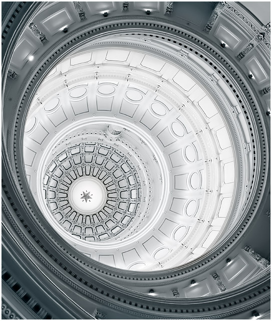
Another personal best!! WTG! This is a nice, clean image. The spiralling lines work really well, and I like the contrast. Nice detail. I don't have any suggestions for improvement. Nice job!
If you keep scoring so damn high, I'm not going to be much help with critiquing!
The thing I really enjoyed most about this entire challenge was how textural so many of the entries were, and this is no exception. The lit portion of the dome is much too bright, and that's about all I can say about this one. Nice work!
Congratulations on your personal best! I like the twist you took with different colors here. I'm sorry, but I just can't accept comments like "I've seen this before" as there are truly only a few photos that you can make and not repeat someone else's work.
Moreover, this one has not been done this way, as both Gordon, myuself, and others that took the same one, did not shift the hues towards chrome.
You have made something massive seem very delicate - like lace. I would have been tempted to make the composition symetrical around the diagonal (bottom left to upper right) but perhaps that would be too convetional and the tension between the angles and the curves makes it more dynamic. For me it feels too tight on the right, and the cropping of the curves at various intersections creates too much chaos.
Wow! This is gorgeous! I photographed the Texas State Capitol too from a totally different angle. Yours is AWESOME!!! You did such a great job with crisp sharpness. The detail is amazing!
I just love those rotundas/domes that people keep posting in different challenges!!! I wish we had stunning architecture like this where I live. A 10 from me, this is very dramatic, B&W works well.





 Add photograph to your favorites
 Add photographer to your favorites

 Photographer found comment helpful.


