If you have any questions or comments please feel free to PM me. Enjoy your critique :)
First Impression:
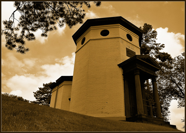
Cool builing, love the sky and the clouds. I like the eye-flow the composition creates.
Composition:
Crop and composition are classic 1/3s which is pleasing to the eye. The perspective gives nice vertical lines drawing the eye through the structure. For me the tree in the bg (right center) is distracting as it takes away from the flow and blends too much with the building. I'm wishy-washy about the tree in the upper left, I think I would prefer you had cut that limb down but sometimes we can't do that. I love the use of triangle for the lawn/grass, it helps move the eye along.
Technical (color/focus/light)
Focus: spot on
lighting: good, I think having the doorway better lit may boost the aesthetics. Overall the building seems a little dark which takes some of the focus off the structure. I'm on a public-non-calibrated monitor so this may or may not be an issue, ymmv.
color: good use of sepia - I like it, and you have good tonal range.
Relevance to challenge
This is a form of architecture so it meets the challenge quite nicely.
Overall:
No oomph factor seems to have landed this in the mid-scoring range. I feel the main subject is washed out by the surrounding tree limbs.
My opinion is the final score reflects the inclusion of the distracting tree elements.
You have excellent work in your port and this is a nice photo as well but imo not up to your level, I look forward to your future entries - you have multiple ribbons in your future.
wow, nice picture, too bad you couldn't have gotten that tree in upper left out of the pic, other than that, I like the perspective and I think the coloring looks nice too, also might look good in calming blue tones as well





 Add photograph to your favorites
 Add photographer to your favorites

 Photographer found comment helpful.


