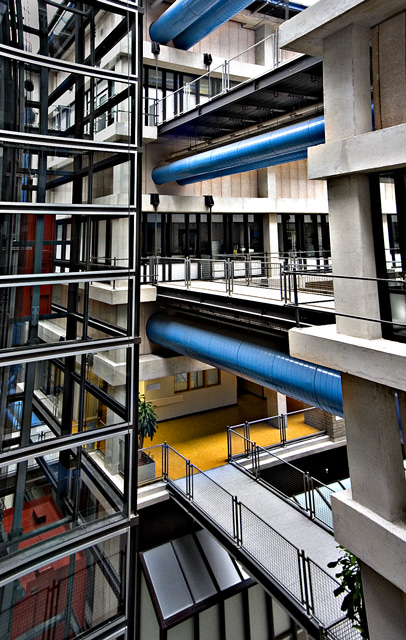
My first impression of this photo is that it is very busy. Too much to look at with my eyes not really finding a main resting point. Not YOUR fault, just maybe not my choice of subjects.
The distortion only adds to the confusion in my opinion as well. It almost smooshes the photo toward the center, making for a smaller area for all the factors of the photo.
Focus and clarity are great. I think you did a great job getting nice crisp lines and sharp edges.'
Color is also good. Nice blues, yellows and reds, without going overboard and oversaturating.
I think going with the vertical crop was a good choice here as well.
You scored well, and I think that was on technical aspects. In my personal opinion, the reason it did not score even higher was simply on visual appeal. The chaos hurts it a bit for me.
Overall though, a technically good shot.
~Heather~
I like the colors and shapes and different materials shown. This is one case where the perspective may have hurt the picture a bit with the right side leaning a bit too much.
I really dig the long vertical aspect of this shot that plays into the feel of the office. perfect colors and placement of the blue and yellow; and the red on the side makes a nice touch too.
Now, that being said, I don't feel you will "wow" people enough to win, but I personally think you are top three and you get my vote.





 Add photograph to your favorites
 Add photographer to your favorites

 Photographer found comment helpful.


