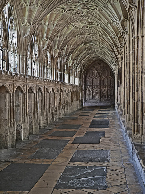
I happened to be at a seminar in Gloucester so I decided to visit the cathedral to see if I could find something for the challenge. London the day before had not been that productive although I go some arty shots. This shot just stood out, taken with the camera balanced on a monopod while held against the wall.
Post processing:
* shadows/highlights
* curves
* a small amount of dodging
* light clone tool use to remove (well, make into a shadow) a light bulb on the ceiling
* size for competition
* noise ninja
* smart sharpen
* save for web
Statistics
Place: 72 out of 281 Avg (all users): 5.9337 Avg (commenters): 6.7500 Avg (participants): 5.6105 Avg (non-participants): 6.2907 Views since voting: 1516 Views during voting: 264 Votes: 181 Comments: 12 Favorites: 1 (view)
I love old buildings like this. I look at them and wonder, if the pillars could talk, what stories would they have to tell? What have they heard and see that no one else ever has?
Compositionally, I love the "off-side" feeling of this. So many times shots like this are taken staight on with exact symmetry, and while that is nice, this composition gives it a bit more "sophistication" I think. I wondered if it might have been stronger with less foreground and cropped horizontally, BUT, I like how the vertical crop keeps everything "close' and the floor leads into the shot.
Technically, it seems to be okay to me. I am on one of the crappy computers at work, so I can tell you what I see. If it is totally off base, pm me and that will remind me to look at home on a decent monitor (this is why I don't vote at work . . .)
The focus looks just a touch off, like perhaps some graininess was unintentionally achieved during post processing, then removed afterwards. As a result, some of the windows and arches look a little artifact-y. (Again,this may just be this monitor).
Overall, this is a great shot. I think if time had permitted (and weather), a more dramatic lighting would have really upped the wow factor of this one and pushed it into the upper 6's
Excellent perspective, rhythum, and symetry. A slight boost in contrast and saturation without losing detail may add to the dramatic impact. I like this one.
I like all the detail you've found by boosting the midtones of your highlights - and in this architecture there is A LOT of detail - adding to it makes it bit extreme. There is nowhere for the eye to rest - although the leading lines of the floor do draw you to the door - you can't settle there. You need to add some contrast - perhaps if the door were less detailed and darker? Perhaps if the door remained detailed and the rest of the hall became lighter or darker?





 Add photograph to your favorites
 Add photographer to your favorites

 Photographer found comment helpful.


