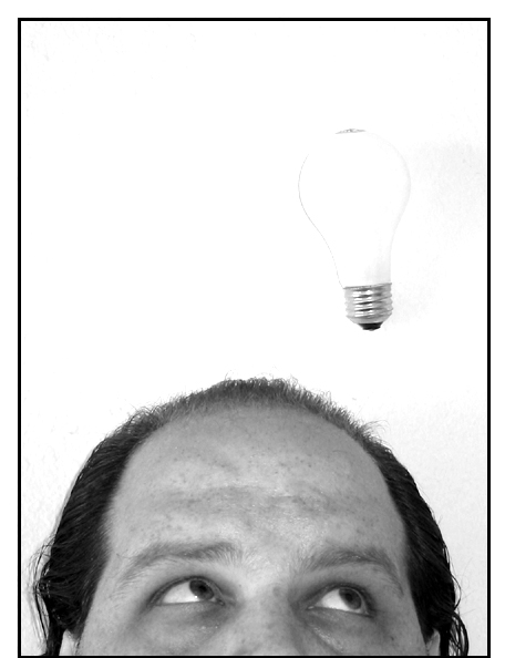
Hmmm. The background and negative space concept works well with the human subject's head as there is enough contrast to bring out the features of the head. Adding the lightbulb detracts from this on one level as the bulb doesn't even have a continuous line defining its surface, causing it to blend with the negative space and leaving this viewer to wonder if any light is supposed to be coming from it (like a dimwitted idea - is this a barely lit bulb?). The noise to the right of each subject is a little distracting and draws from the negative space as well. I do think this is a bright idea for this contest but I think a hooded light source might have made for better results on the negative space. - 5
I like the idea here, but it's so bright the shape of the bulb is almost lost. Is that an accident, or was there a bit of string or the like that had to be washed out also? It's very distracting and I think the picture would be much stronger if the bulb were slightly more defined.
Interesting idea and I am wondering how you got the lightbulb suspended there? Focus is a little soft around your? eyes (which is a key component to get in focus). Whites are a littel too bright as well. BUT, this is still a strong image that I enjoyed.
Straighten the bulb out and it is a great shot. Since this is b&w did you think of using a colored bulb (like yellow) to help get some detail out of it.
Oops, it looks like my shot is similar to yours! Oh well. I do like yours a lot, and the light bulb adds a hint of whimsy to it. Did you try against a black background to make the light bulb stand out more?
I like this shot a lot but the lightbulb, unfortunately, gets lost in the white background. Wouldn't it be fun if it was yellow? Also, the focus on your subject seems just a little soft. For this photo, I think the crisper the better. Very humorous and original though.




 Add photograph to your favorites
 Add photographer to your favorites


 Photographer found comment helpful.


