Based on the story of your image I guessed that you got quite a few 1s 2s 3s and 4's...and after just looking I proved myself right:)) Images like this always make a certain number of voters nervous, but there is no way that this deserves so many 4's and under.
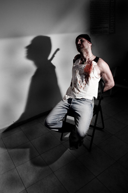
This is a great composition, following the rule of thirds very well. The fact that we can only see the knife as a shadow is excellent and you obviously put so much thought and effort into setting up your scene. You have also cleverly left space in front of the poor guy as if to suggest the presence of the interrogator, creating a little tension for the viewer.
The lighting is great, creating that wonderful deep, shadow. The shirt is a little blown out, but the definition in the arm compensates - drawing the eye away. I like the lack of lighting on the face, it adds mystery.
I love the diagonal of where the floor meets the wall, it adds to the sense of drama. It also serves to divide the image into the light side and the dark side.
The colour is muted but that's perfect for such a sinister scene. Making the blood even redder would have just got you more 1's:))
Well done on a well executed (no pun intended) image.
Obviously an unpopular topic, since technically its perfect, love the composition and use of the single light source (and the topic is great as well, imaginative, very well staged (I'm not so picky as ShutterPug about realism :-) and it really stood out even when I browsed the thumbnails). Well, better luck next time.
Great story telling, great comp, colors a bit flat but it works, great light, great effects, a bit soft on the model, good lines, good movement, shirt a bit blown, chair dipping into the abyss, nice job
I think if the knife were thrust into the man from behind then his head would have fallen forward - not backward. Maybe that sounds picky but I think when you are trying to execute a shot like this every small detail matters.





 Add photograph to your favorites
 Add photographer to your favorites


 Photographer found comment helpful.


