Had to choose as my least fave for that thread. I don't know why, but this image just doesn't work for me. Technically it's good, but boring. Maybe something could be done to spruce up the composition?
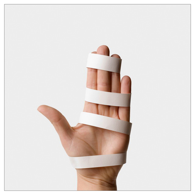
i think that by taking a used, old, repeated idea but doing something creative and different to it, itself becomes creative and new. anyone who automatically gave this a sub-par vote or dimissed it on this basis is probably a bit of a moron - the fact that you even cite someone else in the title makes it clear that it's an homage, and it should ideally be considered as that. to me it's visually striking, simple, clean, and expertly taken. the whites are very lovely. the only slight misgiving i would have with it is that it doesn't really scream to me, this was taken with a single source of light. but then that's lust me being picky and not very technically adept. i like it as a piece of art, and would have scored it an 8.
Hi! Seeing as you were worried about your low scores from the "passe" persepective, I thought I would try out my scoring pro forma on this shot to see how I would have voted. Hope it helps.
Challenge: Single Light Source (Advanced Editing)
Challenge Description: Use a single, artificial light source to dramatically light the subject of your choice.
A Score re meeting the challenge
{ 0} Does not meet challenge
**{+1} Clearly meets the challenge
{+2} Epitomises the idea behind the challenge
B Composition & Aesthetics
{ 0} No discernible compositional form or merit
{+1} Snap-shot like composition
**{+2} Well composed, aesthetically pleasing
{+3} An exceptional composition/exceptional aesthetics
This is as clean as they come. I like the concept of the shot and the use of shadows to bring out the depth of the hand as a lack of shadow would have made this a very bland shot.
C Technical Considerations
{ 0} Technically flawed
{+1} Technically OK
**{+2} Technically well executed
{+3} Evidence of technical mastery/wizardry
While simple to view there is clearly a lot of work in the preparation of this shot, to maintain the overall simplicity.
D WOW Factor
{ 0} Not special/ordinary
{+1} Has some degree of impact
**{+2} Obvious impact
{+3} Slaps you in face
The simplicity of the shot and the use of the simple border really makes you take notice.
Camera Work/Technical: No complaints from a technical standpoint, but this one has become as overdone as wine glass refraction. I think the voters voiced the same feeling with their votes. I do like that you did it in a more creative manner, isolating the hand rather than shooting the entire body.
Lighting: Your lighting is near-flawless. The highlights and shadows work very well to give this image a great texture.
Composition/Content: The centered composition also works very well for this image.
My Opinion: I believe that the image quality is much better than 5.46, but the voters tire of seeing the same idea shot over and again. If this were the first of its type, it would have been a 6+ image, maybe even a 7.





 Add photograph to your favorites
 Add photographer to your favorites

 Photographer found comment helpful.


