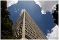
Part of the entrance to ECU. Cropped, cloned an area of shadow from bottom right of image, bumped saturation of blues, increased contrast a little, resize, add border, USM.
Statistics
Place: 80 out of 281 Avg (all users): 5.9010 Avg (commenters): 7.5000 Avg (participants): 5.7282 Avg (non-participants): 6.1011 Views since voting: 1236 Views during voting: 278 Votes: 192 Comments: 8 Favorites: 0
Camera Work/Technical: Terrific focus and nice depth of field. Everything in the frame is nicely seen and there is very little noise in the image.
Lighting: I don't think that the uneven lighting works very well with this image. The highlights produced on the right hand side of the frame pull the eye that way and compete with the nice composition.
Composition/Content: Very strong. Your cropping and leading lines work very well to move the eye through the frame. Without the competing highlights, the eye would flow nicely.
My Opinion: Very nice work in meeting the challenge very well. Very well seen. With a slight lighting change, this one would have been in the 6 range easily.
I used to work at Harvey Norman in Joondalup opposite this eyesore whilst it was being built and I thought it was only half completed when someone told me it was actually finished! Who approves things like this I wonder?
You've done well with the photo though. The lighting is spot on and you've chosen a good section of it to frame. Good stuff Adrian!







 Add photograph to your favorites
 Add photographer to your favorites

 Photographer found comment helpful.


